|
This weeks task is to create a poster for a band, but not just any band. We have been given a band name that is completely made up, so we can represent it anyway we feel suits best. My band name is "Bald Man that Moved", I think I can have a lot of fun with this band name and my initial ideas are leaning towards a blues band who's main member is bald (obviously) and likes to groove. The poster can be drawn by hand and scanned in, but the final result must have been manipulated in photoshop, in order to become more acquainted with the skills and tools needed to use photoshop successfully. Poster InspirationI have been inspired by many different band posters and hope to convey some of the influence I have taken within my own work, in terms of colour, font and technique. ThumbnailsI created a series of thumbnails which helped me with my creative expression and helped me to explore different ideas surrounding the title of my band.  Progress & ExperimentationI have documented my process to show the different design decisions I have made through out the project and the experimentation I have tried with my use of font, background and colour palette. 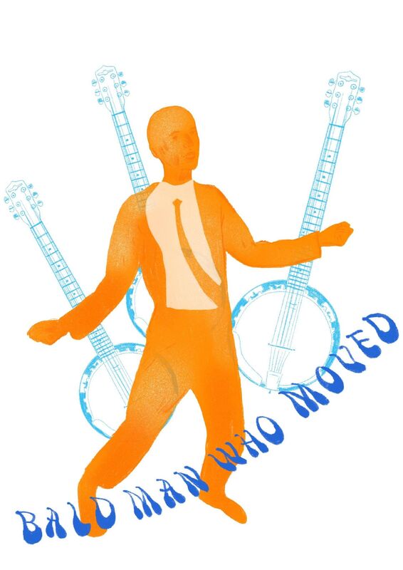   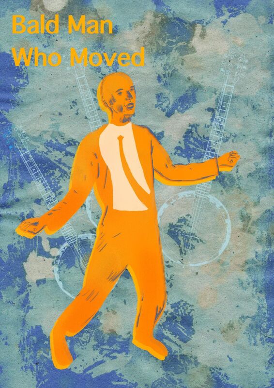  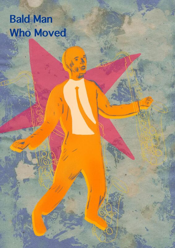  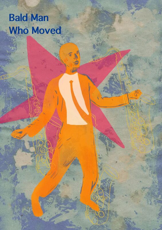  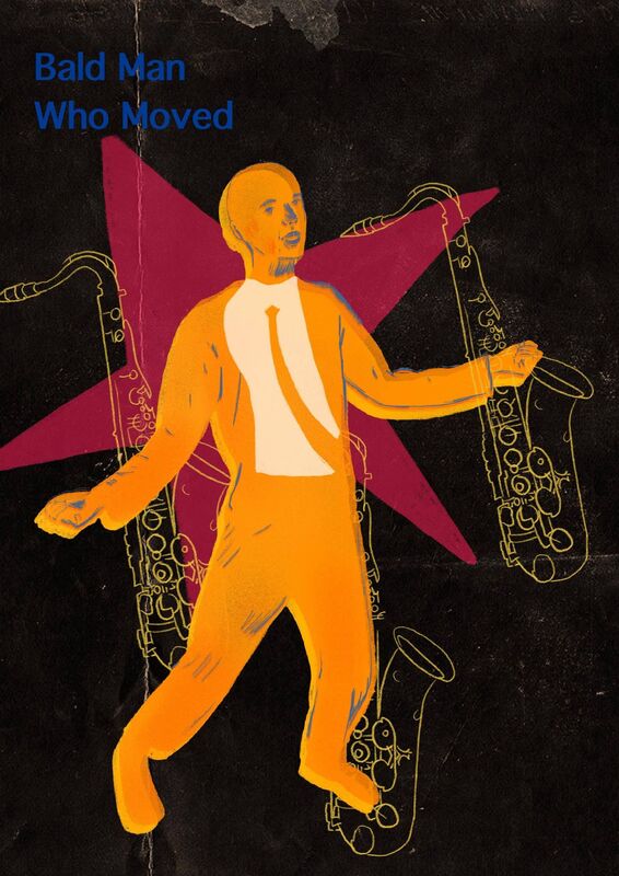  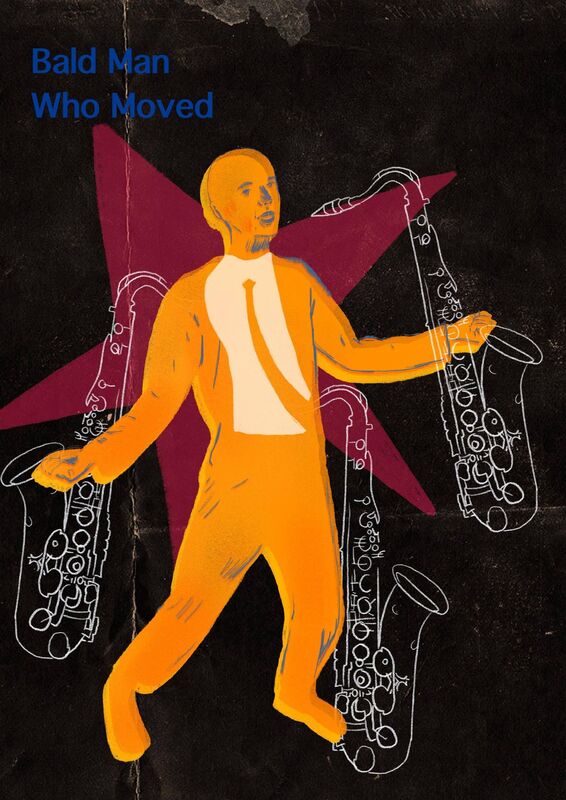     Final DesignsThese are my two final outcomes in response to the brief to design a band poster, using a made up band name. I really enjoyed this project and had a lot of fun experimenting and expanding my photoshop skill set, along side using procreate as they both work using pixels. Overall, I think that both band posters have been successful, but both exude a different style and could be posters for two completely different genres of music. However, I think this is a good thing as it has allowed me to experiment further with colour, design, symbolism and it even comes down to my new found knowledge of how paper texture effects the age of a poster.
0 Comments
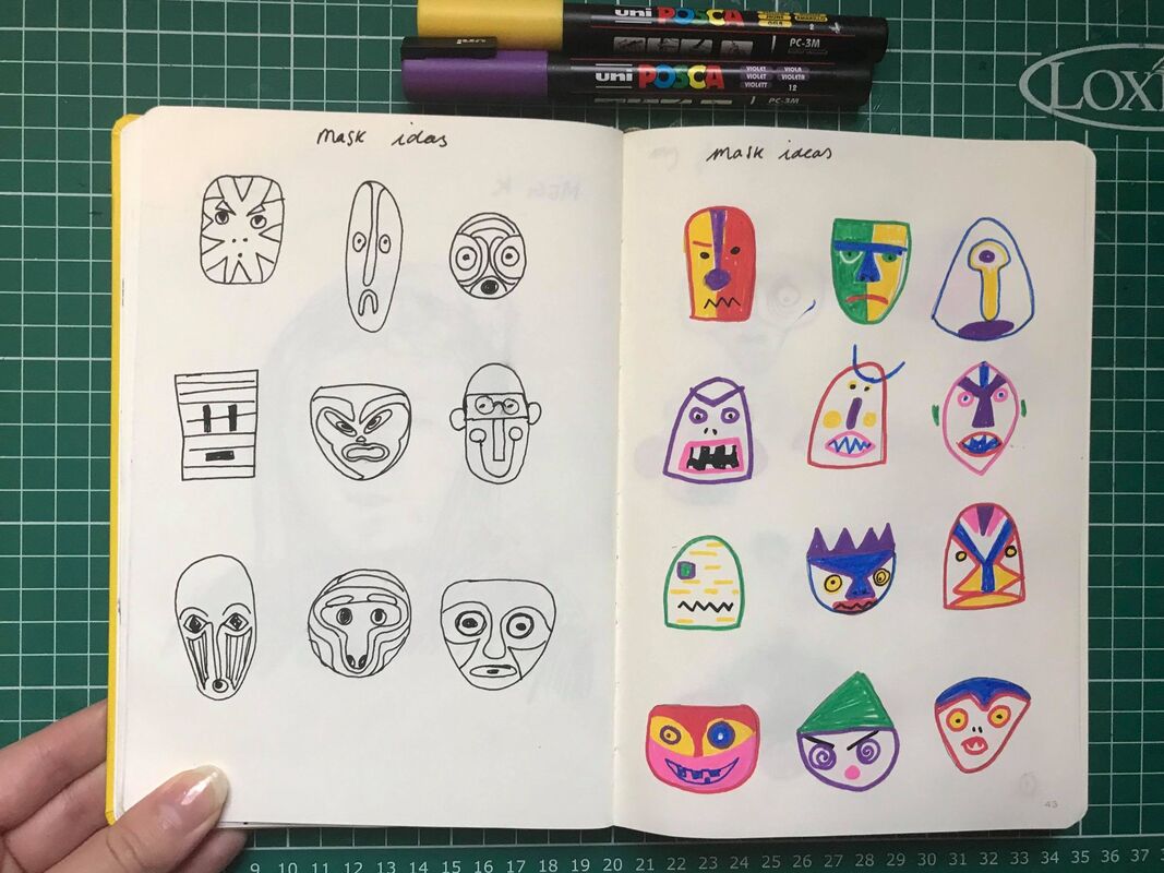
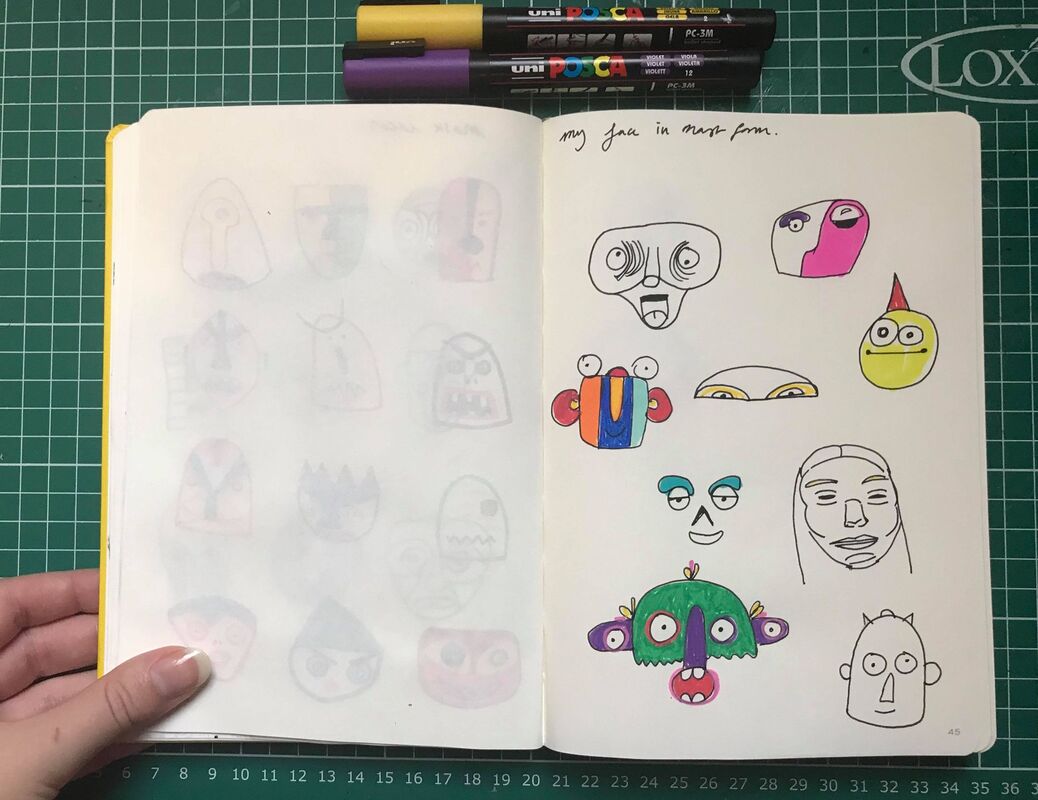
This weeks task was experimenting with painting, using watercolour and acrylic. For this task we had to pick two water colour artists: I picked Ambrose McAvoy and Peter Blake. As well as, two acrylic artists, I picked Ewan McClure and Anne Magill. We then had to take influence from their techniques and approaches and implement them in our own work. Ewan McClureEwan McClure is an artist who has great skill when it comes to technical painting, using broad brush strokes layered on top of each other to capture even smaller details. I enjoyed trying to recreate his technique, but I focused too much on trying to get the objects to look like objects rather than being braver and using bigger brushes and being patient enough to let the piece come together on its own. My work:Anne MagillI really enjoyed recreating Anne Magills' style and I tried to be a lot braver this time around when it came to using bigger and more textured marks to describe the objects. Technically speaking, parts of my drawing area little off and I feel that I smoothed out the surface of the cup quite a lot, which is a shame as it comes away from Anne Magills way of working. My work:Ambrose McAvoyAmbrose McCavoy is an artist well known for his portraits in watercolour and his use of bold colours which are blended together fluidly. I have tried to replicate his technique by drawing out the portraits in pencil first and having visible pencil details in the face. I did one painting using darker colours and another using brighter colours, I found the one with brighter colours more difficult to replicate as i am not as confident using watercolours in that way. My work: Peter BlakeI found Peter Blakes style to be one of the most fun to recreate, but also one of the most difficult as I had not realised now many layers went into making up the brightness of his watercolour paintings. If anything that was the most difficult thing to do as it meant waiting for the paint to dry and knowing where to add more watercolour to add depth to the painting. My work:This project was about having fun and making a mask that embodied you, so it could look like you or it could be an inventive version of how you view yourself or aspects of your personality. I decided that I wanted to make a mask that was bright and conveyed things that I love. I started planning my ideas in my sketchbook, drawing some simple plans including unusual shapes and then progressing by adding colour. I started with the idea of creating a recognisable face shape, incorporating features such as, eyes, nose and the mouth. However, I felt that the more experimental ideas were more fun and I was more interested in the mask conveying more about my personality rather than what I look like. This was how I decided on making my mask look like a rabbit, as they are my favourite animal, with their gentle natures and fast reactions, I like the way they live as part of a community which is how I feel as an illustration student. I wanted to use bright colours, as I see myself as a cheerful and upbeat person with a love for the weird and wonderful. I made this mask from manipulating cardboard into round shapes which I then taped together and putting Papier-mâché on top. After the Papier-mâché dried I painted a few layers of orange on top, waited for it to dry and then added details with a selection of posca pens. I also added ears which were made from card and painted purple, I used a limited colour palette and liked that they stood out from each other.    Overall, I really enjoyed this project, as I feel it has allowed me to develop my 3D skills, but most importantly it has allowed me to express myself through illustration using a method that I would not normally choose too and I have thoroughly enjoyed the creative process.
During our lecture we were tasked with making a mask, in one hour, from found material, as a practice test before embarking on the real thing. The aim of this task was to make us feel more confident about playing with materials and not overthinking a concept or idea. Ultimately, the task was to have fun! I have used a limited range of materials, including cardboard from amazon packaging, card, paint samples and posca pens for detail. I really enjoyed this task, as I often find myself overthinking and worrying about it looking good, which inhibits me from having fun. I think if I had had more materials to put to use I could have had even more fun and created something much more three dimensional. I recently found an Instagram account which made me chuckle called @eyesonamazon and it reminds me of this mask and just shows that you can make art from anything and have fun at the same time!
This weeks task was to capture the essence of cats and dogs through three dimensional practice, using found material. We looked at a few different three dimensional artists, but the artist I was most inspired by was Alan Fletcher, who is primarily known for his graphic design work. However, "These creatures were conceived one holiday to amuse my three year old grandson. We constructed them from wine corks, flip-top cigarette packs, toilet roll cores, bottle caps, ice cream paddles, drawing pins, film cassettes, plastic spoons, local newspapers, flour and water, watercolours, varnish, and lots of patience". This is a direct quote from Alan fletcher, which I have taken from his archives.  In the Images below I have documented my own creations which have been inspired by Alan Fletcher. The materials I have used mostly came from routing through my recycling bin, stealing the tops from bottles and spending hours papier- mâché -ing. I added colour by painting layers of acrylic on top of the papier-mâché and the finer details were drawn on with posca pens. I tried to use different shaped objects so each character would look a little different from its counter part. I feel that I have captured the essence of cats and dogs in making my little friends a little abstract and unique as Alan Fletcher would have done, but keeping them with their recognisable features such as pointy ears and whiskers for a cat and droopy tongues and flapping ears for a dog. Overall, I had a lot of fun making this little unusual family of cats and dogs and it made me realise that good illustration doesn't always have to be serious - it can be fun too! Our final dip pen and ink task was to do a drawing of a room in our house, I picked my bedroom as it is the place where I spend most of my time. I used Lucinda Rodgers as my main influence for this piece, which I think I have captured well by using variety in my mark making. I sketched this piece in pencil and then went in with ink using a smaller dip pen for the finer lines and a bigger dip pen for the thicker lines. The most difficult thing about this piece was deciding where to add the thicker lines as Lucinda Rodgers seems to place line instinctively, where as I had to be a bit more selective in my choices. I think my favourite part of this piece is the pillows and my little teddy creating a slight shadow, as I feel I have captured a very sweet detail. If I was to do this task again I would possibly choose a different artist, as I wish I could have captured the light in my room spilling on to my bed in more detail which I could have done quite successfully using a cross hatching technique. Overall, I feel that I have been successful in taking something 'boring' and making it interesting.  |
AuthorStudent Illustrator. Archives
December 2020
Categories |


 RSS Feed