|
This weeks task is to produce visuals for a series of scenarios, imagining they are full-page, colour illustrations for a hardback book and will therefore be executed in a portrait format. Starting with a series of quick, thumbnails (60mm high X 40mm wide), executed on paper using appropriate media, colour and tone. Producing multiple ideas/compositions will allow my work to evolve into a more finished client visual. The titles/scenarios are as follows: Ambushed - two figures - a city's back streets - night Vertigo - a steeplejack - daytime - windy day Tango - two figures, movement, sexy, close, exotic, café Systems Failure - one figure, spaceship, physical struggle A Giant Leap - rooftop chase, three figures, peril, bravery January Sales - claustrophobia, queuing, doors opening, multiple figures AmbushedI have tried to capture the range of tone used in my thumbnails to inform my final piece, making the piece feel more three dimensional. I have used a monochromatic colour palette, as I wanted to concentrate on using lights and darks to push the tonal value, I also think it adds to the foreboding of the scene and the imminent feeling of dread.   VertigoDoing the thumb nails for this piece really helped me to experiment with view point and perspective, as my first few thumbnails are quite similar in the way they are set out with the tower being the most commandeering part of the piece with a small figure placed somewhere on it. I realised that these compositions were feeling similar and not very exciting so I decided to experiment more to find a more dynamic angle. I decided on the falling man as I felt the composition was engaging and instilled the feeling of vertigo that I was hoping to capture. 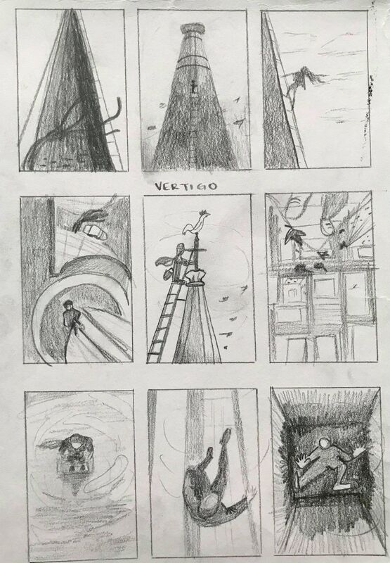  TangoI found it quite a challenge to create interesting compositions which captured the sense of movement between the figures and putting them into a café setting, However, I enjoyed rendering the final piece and when for a vintage feeling with the colour palette with subtle browns and reds, adding to the sexy and close atmosphere. 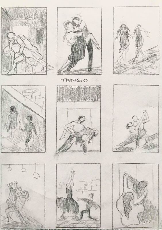  System FailureThumbnailing for this idea was difficult, as there was a lot of space to fill (pardon the pun!) As wells as thinking about how to fill the space by creating a dynamic composition there was also the question of the struggle and how to capture the physicality of that action which I decided to depict by the hands reaching towards each other, as if on of the spacemen had come detached and was floating away.   A Giant LeapWhen creating the thumbnails for this piece I used reference images of parkour runners to capture a sense of bravery and peril. I decided on my final piece, as I felt the positioning of the figures drew the viewers eye through the piece and created a dynamic composition.   January SalesThese thumbnails were difficult as I felt that the sizing was a little bit restrictive and there were so many figures to fit in to the composition which needed to be rendered fairly proportionally in order to create a realistic sense of claustrophobia. This is also the only final that I've rendered horizontally, as I felt that the vertical composition was not working as there was more space which reduced the feeling of claustraphobia. 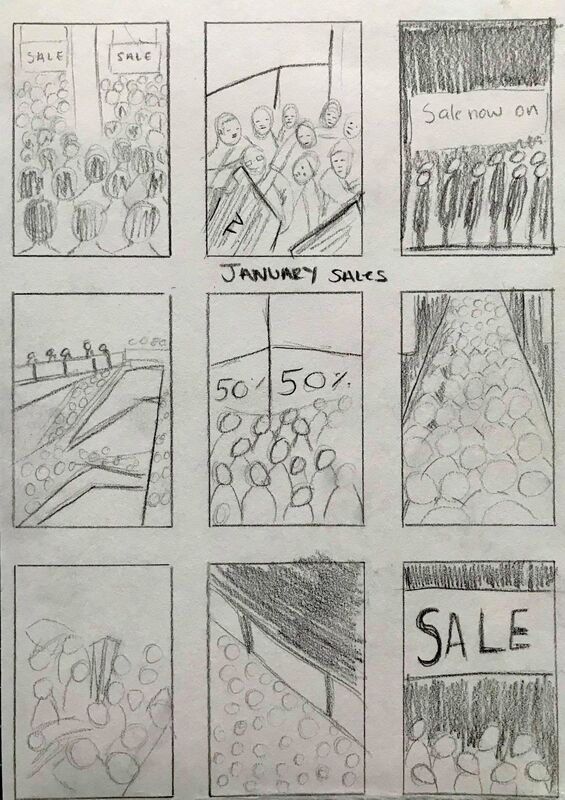 
0 Comments
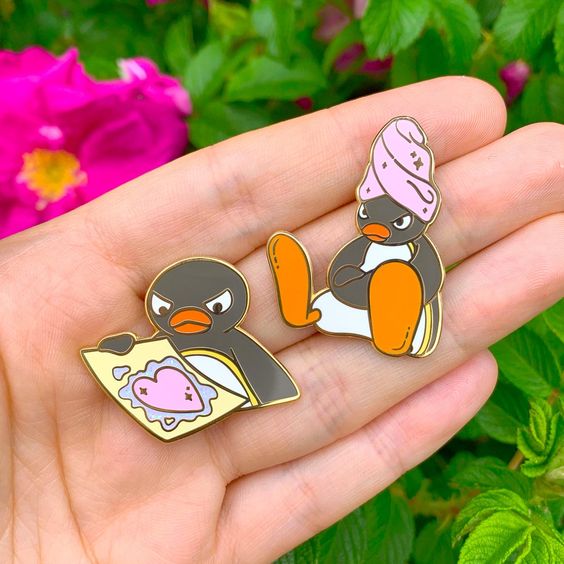
This weeks task was to design three enamel pin badges, which had to be inspired by a pop culture reference. The brief outlined that we had to create 3 enamel badge designs, using a cohesive visual language across the set, create a backing card design, as well as a Logo / branding for the collection. The only 'rules' we had to follow was to limit our badges to 4 pantone colours and that the badges should be based on an existing pop culture property, which we could choose to parody or pay homage, created in a style of our own devising. Enamel Pin InspirationThumbnails:I always start my design process by creating thumbnails, as they allow me to see what ideas are successful and which ones need more work. It also helped me to visualise how I could use the same four pantone colours throughout my designs to create a cohesive visual language.  Enamel Pin DesignsI felt that a lot of my initial pin designs were quite simple, as it was my first time using illustrator and I was just getting to grips with how to use the different tools and effects.       Initial Mock Up DesignsI found that these mock ups appeared rather clunky and unfinished which was not what I wanted to portray. I actually found that the designs on my backing cards were more ambitious and would make good badge designs.    Final Complete Mock upThese final mock ups of these complete enamel pin badges and backing cards convey the many things I have learnt from this project, including using illustrator and how to make a 2d design feel much more tangible by adding simple things like cast shadows and adding a hanging tab to my backing cards.  To further improve on this project, I should have added a website or Instagram link on the bottom of my backing card, as it is so important to market your website, as people will visit it to look at designs and then if they like it, buy things from you and share your work with their friends. Overall, I ended up really enjoying this project and would love to one day design and sell my own enamel pin badges. Things I struggled with most was using illustrator I found it difficult to locate and use the different short cuts that would have made things easier for me, however I watched a lot of YouTube videos which helped inform my practice and in reality the more you use a specific software the better you get so I look forward to my next illustrator project with a lot more confidence in my abilities.
|
AuthorStudent Illustrator. Archives
December 2020
Categories |


 RSS Feed