|
This module is all about the techniques, media and technicalities of making illustrations, exploring and experimenting with four 'classic' ways of getting that ink onto a flat surface: dip pen, fine-liner, brush and 'improvised' brush. Looking at techniques such as cross-hatching, stippling, local tone and the use of pattern and solid black. As well as, experimenting with the techniques by making drawings of two things: 1) a simple still life involving books, cups, plates and a bottle and 2) yourself (self-portraits).
0 Comments
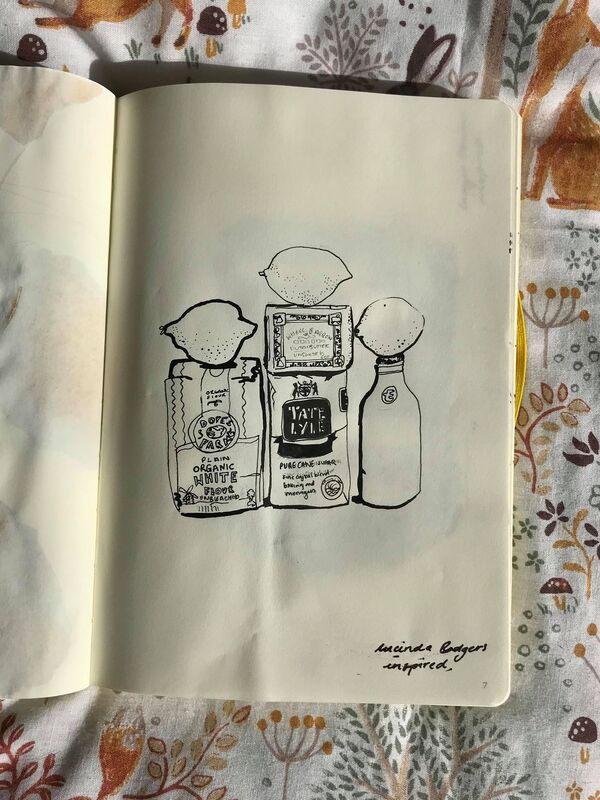
Lucinda Rogers works directly from life using ink, crayon and watercolour on paper. Her work mainly explores drawing different cities including, New York and London where there is a vibrancy of life which her drawings capture perfectly. However, for this project I have been most inspired by her still life drawings where she makes the mundane interesting with unusual compositions and a thick black line which she places instinctively. I have loved studying the way Lucinda Rogers composes and illustrates her still life pieces, as I think the technical skill and detail that she produces in these pieces have a direct correlation with that of her urban sketches. I felt that I learnt a lot from copying her study of the condiments with the lemons stacked on top, as I was in awe of how brilliantly recognisable all the items were and how, even down to the fonts used, she had captured them perfectly. I took a lot of inspiration from this particular piece when taking condiments and food from my own kitchen to compose a similarly, visually intriguing composition. I feel that I have been successful in creating a convincing still life that has obviously been inspired by Lucinda Rogers. I was very concerned with capturing the fonts of my chosen foods correctly, as I felt that was a big part of what made Lucinda Rogers work so accurate and playing with the thicker line placement informed my practice and helped the piece to appear more three dimensional.
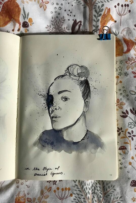
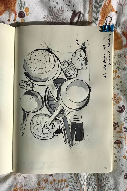
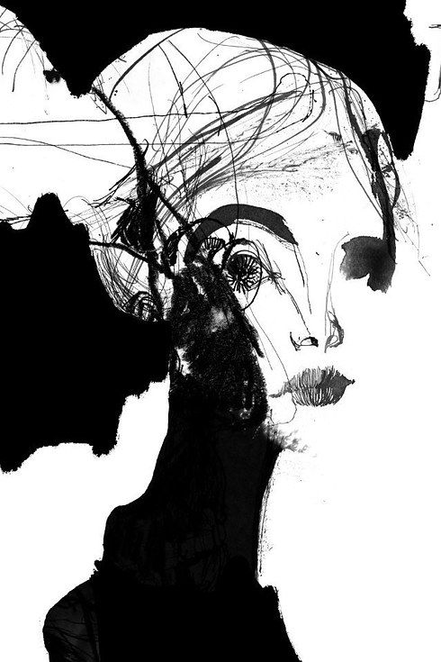
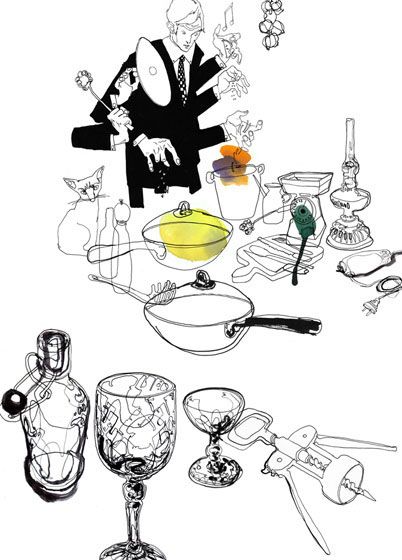
Daniel Egneus is a vivacious artist, who uses mixed media to depict a wide variety of subject matter. I have looked at his pen and ink drawings to inspire my practice, including the way he illustrates a face and his still life pieces as they were the most relevant for this project. In the work I have produced I have tired to convey how I have been influenced and inspired by Daniel Egneus. I enjoyed recreating his art work and feel like I created a successful copy. However, I have struggled to recreate his style in my own portrait, as I feel I have controlled the line too much. I got too caught up in trying to capture my own likeness, rather than being more expressive and experimental with my line and use of ink. I learnt from this and in my drawing of the pots and pans I have tried to play with perspective and feel that I have been more playful and confident when putting down marks. Next time, I think to further my self improvement I could have experimented with drawing different objects aiming to capturing more intricate and lucid details to contrast with the bolder and brisker marks.
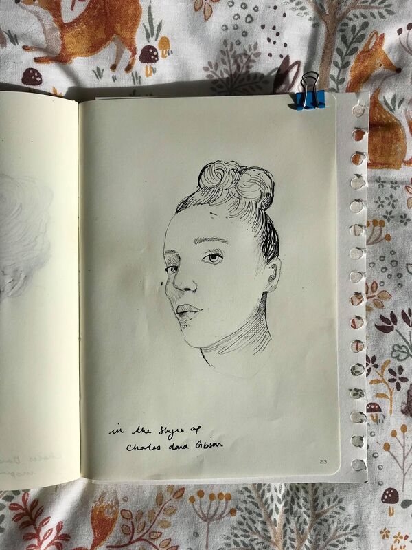
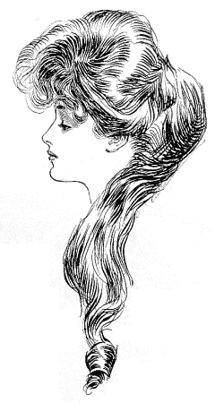
Charles Dana Gibson was a prolific pen and ink illustrator, best known for his creation of the Gibson Girl, an iconic representation of the beautiful and independent American woman at the turn of the 20th century. His wife, Irene Langhorne, and her four sisters inspired his images. I started to study Charles Dana Gibson's style by doing a copy of one of his own drawings so I could being to understand the way he uses pen and ink to sculpt the features of the face, with a mixture of delicate and bold lines. The thing I love most about his art work is the way he uses ink to convey the density of the women's hair and how he leaves negative space to describe the light hitting the models. However, this was one of the techniques I found the most difficult to re create, as it meant knowing when to leave spaces blank and knowing when to add more ink. In my self portrait I feel like I have managed to recreate the technique fairly confidently, but a lot of the charm of Charles Gibson's work is lost in my own recreation, as I have not depicted myself with flowing hair that sits gracefully atop of my head like the Gibson girls and I have not been able to convey the same sense of elegance that he masters so beautifully. However, I think that I have taken a lot away from this style in terms of understanding the technique and being able to re create it. I feel like this technique is very good for the delicate details and creating a contrast between dark and lights. However, I think that there are better techniques for creating a more advanced tonal range and building up more marks.
Edward Gorey was an American writer and artist well known for his illustrated books. He created unique characters, who often appear strange and unusual in unsettling atmospheres, usually set in the Victorian era. When studying an artist I always begin by doing a copy of their work to get a feel for the way they use line and how they apply their media. I am in awe of Edward Gorey's attention to detail and the way that each of his characters have an indistinct personality. His work is very stylized which makes it easy to recreate, but difficult to add an individualistic spin on which I have tried to do by drawing myself in his style. I wish I had been more adventurous within my own depiction by adding more background details, as I think it would have really challenged my use of a dip pen and ink. However, I learnt a lot in terms of adding detail to clothing and the way that line can be used to create different textures to represent a certain type of material.
|
AuthorStudent Illustrator. Archives
December 2020
Categories |


 RSS Feed