Visual Identity
Week One - Visual Voice
To Do List:
- Watch the following links and make notes (drawings) in your sketchbook, record how you feel about what you’ve observed.
- Find 3 Artists that your work relates to from the Graphics Witness Website
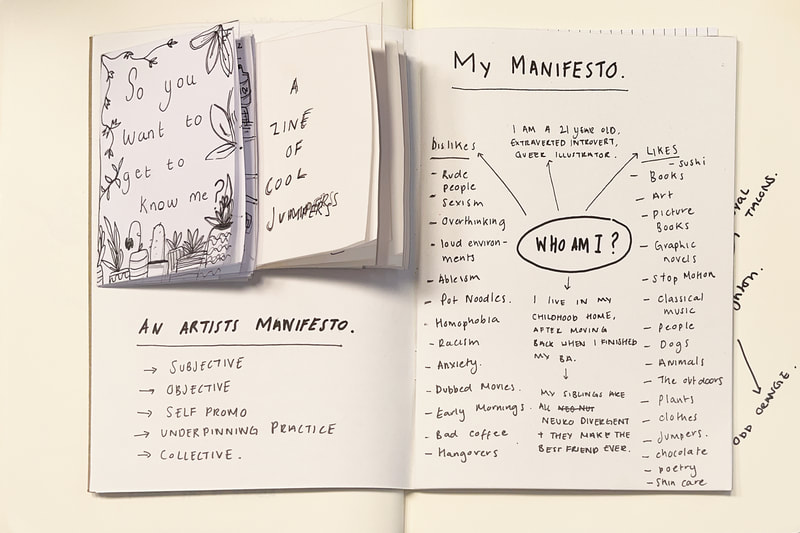
- Create your own Manifesto and produce this as a Zine. Deadline: Next week’s Thursday session (6th oct).
Task 1
Visual note taking in response too: Alain de Botton and pussy Riots Manifestos.
Task 2
Three artists that my work relates to from The Graphic Witness Website.
Task 3:
My artistic process often begins with finding inspiration, creating mind maps, forming thumbnails and playing with layouts. I was initially struggling with this project as I found that I felt that I care about 'everything' while also caring about 'nothing' significant. So I began my zine journey with looking at the surface of my self in the mini zine 'so you want to get to know me'. This was a very simple and quick response to the brief set in class which tells the viewer different simple facts about myself. I then created 'A zine of cool jumpers' which is again a mini zine and was a response to a physical thing I like.
After feedback
After confessing to Tara that I was struggling with this very simple project we found that actually there is something that drives me and that is how I am overwhelmed with the amount of topics that I am supposed to care about and know about and be informed on. It's a point in itself that in todays media when we are immersed in the trauma of the world that sometimes we have to protect our minds because if we care about everything deeply we might explode. Not literally explode, but become so overwhelmed that we choose not to care about anything at all because its too much for us.
Zine Inspiration
Final Outcome
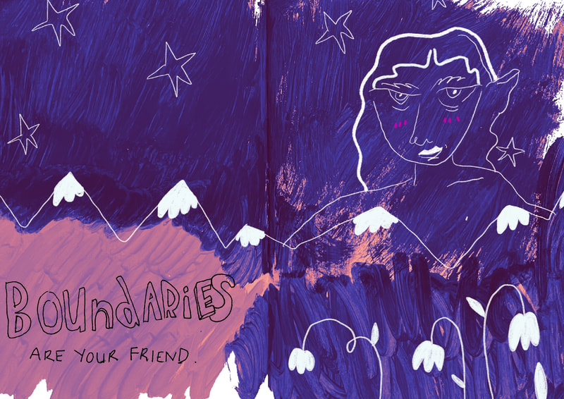
For my final outcome I have experimented with combining physical and digital mediums. My type has all been hand rendered as well as the painted back grounds which I have scanned in and moved to procreate, drawing over the top with the 6b pencil in procreate. The result is a simple but textural zine which feels raw, responding to the topic of the zine 'being overwhelmed'. I wanted the pages to express that heavy weight of being overwhelmed which I think is conveyed through the visceral mark making, combined with the delicate lines that I have used to depict the figure. To improve this project I could have experimented with using physical printing techniques such as the riso printer. This is still potentially something I could do if I get time, as I think the outcome would be interesting.
Task - Write a brief
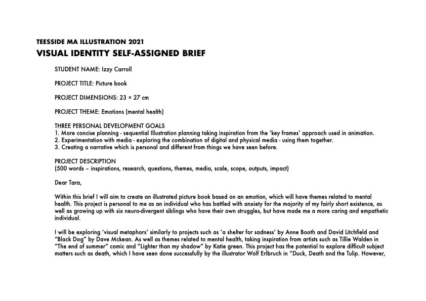
This weeks task was to write a brief based on our manifesto, something that would communicate with the viewer in the form of a physical outcome. After looking at my interests and process I have decided that producing an illustrated book would be an appropriate and creative way to communicate my manifesto subject into something which also enhances my practice and communicates my subject.
My sister and her sadness |
Inspiration |
|
My idea is to create a childrens book (ages 5-7), where the story will follow a boy (6 years old) and his sister (12 years old).
As his sister is of secondary school age it allows for her to have a wider emotional capacity, but as a 6 year old the brother is old enough to be aware of his own and his sisters emotions. The problem - His sister doesn't want to acknowledge her sadness, viewing it as something separate from her. The solution - The brother will teach his sister about opening up and letting the sadness out of the jar. |
Andrew Loomis
|
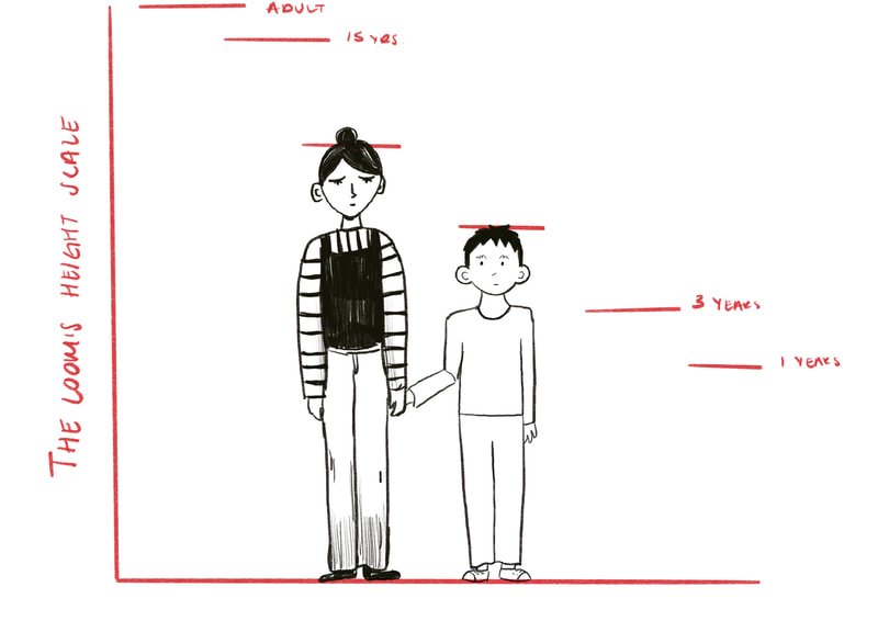
Andrew Loomis is very good at explaining the necessary knowledge for understanding the human form. This Link takes you to a pdf slide show of his book "Figure drawing for all its worth".
The figure on the left is Loomis' method for drawing figures the right height for their age category. This will be helpful for me when drawing the brother and sister. |
Initial development
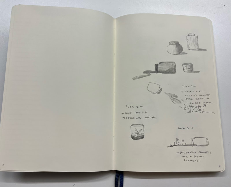
This is work I produced as an initial response to my project.
Further Development (after feedback)
Work I produced in response to feedback from Tara. I wanted to draw the heads from multiple angles and also figuring out the height of my characters in proportion to each other felt really important to create believable characters.
Sketch Book Work
Another piece of feedback from Tara was to work in a sketch book so that I can be looser with my experimentation.
Post it note plan
I was recommended this technique of planning my story by using post-it notes to plan the order and sequence of my narrative as it allows for a much more fluid way of planning pages and measuring the amount of text used with on each page.
Responding to feedback
This week Tara's feed back is:
1. Consider starting narrative with the flashback of happier times between the siblings
2. Check the tenses (keep everything in past tense)
3. Consider text length (can it be condensed)
4. Explore 'naive techniques'
artists to explore the work of: Bretcht Evans, Eleanor Davis, Hannah Mumby, Marlene Dumas.
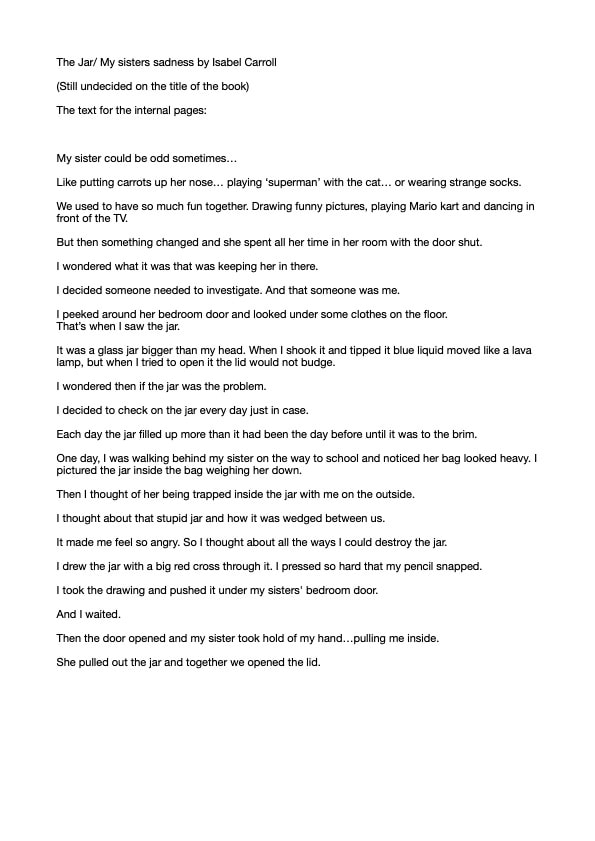
Revisiting the textWhile responding to feedback I have managed to shorten the text considerably while still keeping the impact of the story present. Also I feel that working across double page spreads (12 in total) will help me with time management and completing this work by the deadline. It has also been something that I have seen done quite often within childrens' illustration.
Naive Illustration TechniquesIt is my aim to achieve a childlike approach when it comes to making the final illustrations for this project. I hope to combine a few techniques, including pencil drawing and collage. I have specifically drawn inspiration from the text "Duck, Death and the Tulip" by Wolf Erlbruch.
|
Concept Work Up
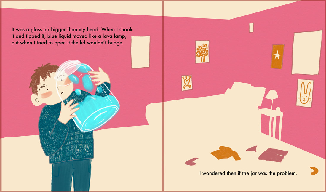
The aim of creating a concept piece is so that I can feel confident when creating the pages for my book. Within this concept piece I have experimented with, media, colour and character design. The font I have used is futara but I am just using it as a placeholder and I will use something more original when it comes to the final thing. I have created this piece digitally, but I think it has a very organic feel, especially with the mix of textures used and the simplicity of the collage background which I will use as a running theme throughout the narrative. I also want the colours, blue, pink and orange to be use continuously to create a cohesive feel throughout the book. The outline in red is the bleed and the central line as I would love to see this book printed.


