|
Over a two week project I experimented with using colour and composition. Within the first week we focused on colour, creating a colour wheel to come to grips with primary, secondary and tertiary colours and creating a grey scale as well as matching a previously mixed colour at the correct position on the grey scale. We then re-created the classic Bauhaus colour and personality exercise, exploring colours power to communicate, mixing colours that we found visually appealing. Then using a limited palette of three primary colours and black and white I mixed colours, using my knowledge from creating the colour wheel, to create colour palettes that communicated theses things; 'Mumbai', 'Rain forest', 'Blackpool', 'Misty Morning', 'Autumn' and 'Hospital ward'. Within the second half of week one we experimented with letter forms, with the aim of creating six digital typographic designs. From this exercise I learnt that combining shape, composition and colour is a powerful method of communication. The challenge of this task was that the frame we had to work in was A6 and we had to choose which type face (Bodoni, Rockwell, Helvetica, Clarendon, Din and Avante-garde), would match the problem; Scale, Playful, Power,Pattern, Feminine and masculine. I created my pieces using InDesign, although I have since learnt that illustrator would have been the better choice as it allows for a more experimental way of working. However, I found this task very helpful as it allowed me to experiment with colour, composition and shape and by combining the three I could understand more clearly how each element effects the others. Within the second week the illustrators project was to research the techniques and processes of three illustrators; Anne Yvonne Gilbert, Charles Keeping and Brad Holland with the aim of creating three book covers within their style. I experimented with each of the artists choice media and the way they used it, coming to terms with their technique and how they exploit colour and composition within their work. The title of all three book covers was "The Tree", but they were each for different genres: a children's book, science fiction and a psychological horror, clearly using the style of the artist that I thought best suited the genre. For the children's book cover I used colour pencil on watercolour paper in the style of Anne Yvonne Gilbert as I felt her work would be the most suitable due to its friendly and soft appearance. For the science fiction cover I used acrylic paint on canvas, in the style of Brad Holland due to his inclusion of interesting skies and the way he combines out of this world elements within his work. For the psychological horror I used ink and watercolour in the style of Chris Keeping, as i found that the intensity of the colour he used could be quite disturbing. However i found that I needed to be braver when it came to recreating his style, as I only used one colour, where as Keeping combines multiple colours. I created all the book covers by hand but then edited some of the colours in photoshop and added text, trying to use a font that I felt matched the cover.
0 Comments
Bsonnie MacLean was one of the only female artists involved in the music scene of the 1960s she created concert posters for the Fillmore rock concerts and was heavily influenced by art nouveau and the psychedelic style of the time. Bonnie MacLean was an integral part of Bill Graham’s organisation when she took over poster design in 1967 after Wes Wilson quit. MacLean’s early work was highly inspired by Wes Wilson. A lot of her work was inspired by Medieval, Gothic and other European imagery. She created precise drawing and lettering. Over time her posters matured, developing a definite identity as she became more comfortable within the genre, where she ultimately forged a unique poster style that celebrated illustrative portraiture and swirling, psychedelic typography.
In 1967, making unusual posters was a popular thing for illustrators of the time, many of them having connections with the music promoter Bill Graham. Maclean experimented with bright contrasting colours and optical illusions which made reference to the visual effects of hallucinogenic drugs such as LSD. The detailed and slightly illegible typography used on many psychedelic posters, as well as swirling lines, was supposedly a visual meaasge, who those already indoctrinated to psychedelics could read. However it was also inspired by earlier design movements, such as Art Nouveau.
The two pieces above are another example of the similarity between Bonnie Maclean and Wes Wilsons work. in terms of the layout of their page and the warmth of their colour palettes it is easy to see where Maclean has taken her inspiration. However I do also find differences between their way of working which includes the fact that Maclean's typography is much more legible than Wes Wilsons, making hers less like that of the hallucinogenic style, but probably a more successful poster design, as more people can read it.
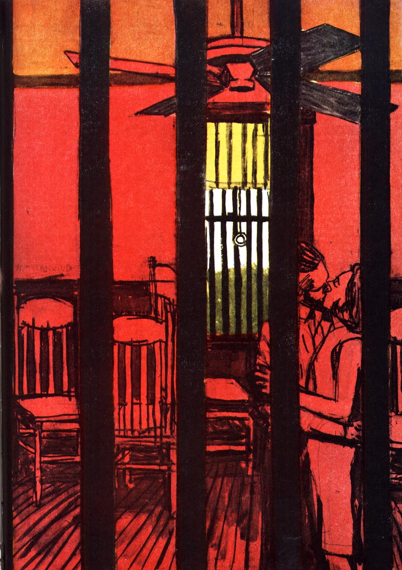
In today’s lecture we looked into American life in the 1950s, understanding that the war had allowed this country to prosper hugely, which is reflected in the illustration of the time. We looked at many different illustrators including people like Norman Rockwell and Bernie Fuchs. Robert Weaver was one of the artists we talked about in the lecture who I was intrigued by. I found that his compositions were unusual, especially the way he uses perspective, with the viewer really having to search for the focus of the image, creating a voyeuristic feeling as we try to capture a glance of this couple stealing a kiss. Brian Sanders was another illustrator that we looked into, finishing that his work was experimental and reflected the excitement of the times. He made his work interesting by using off-kilter compositions and bright colours. The medium he worked with was acrylic paint and he developed what was referred to as the ‘bubble and streak’ effect. In 1965, Sanders was commissioned by Stanley Kubrick to be an on set reportage illustrator during the making of 2001: A Space Odyssey. Sanders would draw on the set two days per week and work on larger paintings in his studio, mapping out the making of Kubrick’s 2001: A Space Odyssey.  This was my attempt at creating an illustration which shows a mundane moment, I have tried to make this piece look exciting by being influenced by the techniques used by Brian Sanders and Robert Weaver. I have combined elements of the two artists, such as using a painted, streaky back ground like Brian Sanders and trying to play with making the foreground more prominent than the background like Robert Weaver. Yet I still feel like there are a lot more things I could have done to make this piece more visually interesting, including experimenting with a more vivid colour palette and using a less central composition. However, I feel that this practice has allowed me to take a step back from how I would usually work and be more open to learning from such brilliant illustratiors.
For this project our main aim was to create multiple thumbnails to focus on the importance of idea generation and the journey it takes to get to a final piece. For this project we had to choose a play from a select few and design a poster for it, the play I choose was Eqqus. This project has allowed me to explore the technique of creating thumbnails, as it is a fast way of generating ideas and allows more choice when it comes to selecting work that can be refined into final pieces. I feel that I was able to work quickly using this process, creating multiple ideas rather than labouring over one idea, which ultimately wouldn't be as good due to the lack of experimentation and idea generation.
In todays lecture, the poignant question asked while discussing fashion photography, editorials and art direction was, " Is fashion editorial art or fart?". We started by looking at how Vogue, as one of the most well-known and respected magazines, influenced visual culture through its approach to editorial fashion and how the style changed to reflect the culture of the time. The first fashion story is from a February 1984 edition of Vogue. The model on the front cover looks playfully out at the audience with a neat and dainty smile. The Vogue logo has been printed in a hot pink to highlight the spring feeling and sits across the top of the magazine. Within the magazine I have selected a purely black and white editorial piece about affordable summer fashion. For Vogue creating a piece about affordable fashion, with items ranging between £10-£40, contradicting the ideal that Vogue only advertises to the wealthy. I think that the use of black and white photography within this editorial makes the model seem more reachable in terms of young women being able to identify with her in that time period and the mixture of styles presented opens her up to a wider audience, as she wears simple outfits that can be dressed up and her poses are used purely to display the clothes that she is wearing which is why she looks so wooden. The second fashion story I will look at is from a February 2019 edition of Vogue, featuring Emma Stone. Emma Stone is a well-known actress with much celebrity due to the success of her films. The front cover uses bold colours and keeps the iconic Vogue font. The way the actress is posed on the front cover displays to the viewer a powerful and serious individual. Within the magazine itself the editorial piece Emma Stone is captured in a grungy lighting, with what appears to be a more natural and comfortable way of posing. I feel that the photography has links to that of Corrine Day, who was a photographer for Vogue in the 1990s and whose work had a more realistic quality, moving on from the polished glamour of the 80’s. Overall, from looking at two Vogue editorial pieces from different time periods and cultural influences, I have been able to recognise the way that Vogue changes to fit with the movements of the time and how in someways it has become more inclusive, but on the other hand it has become immersed in the publicity of celebrity, rather than having the sole focus of bring fashion to the people.
This weeks blog task was to create a collage in the style of the work, "What makes todays homes so different, so appealing?" by Richard Hamilton. The idea was to create our own version of the famous pop art piece, incorporating recognisable images from current culture and society.  Within my collage, which I created using photoshop, I have incorporated famous figures including; Kim Kardashian-West, Kanye West and Theresa may (on the tv). I wanted to include figures that many people find controversial, as I feel that in todays society people look to celebrity and talk about politics more than they ever used to. I have also included a child sat on an iPad, as many children are being introduced to technology at much younger ages and spend less time playing outside, which has spurred many arguments as to wether technology is damaging for the youth. Within the background of the image, though the window, a pro- democracy riot can be seen, which is occurring in Hong Kong, due to their government being a communist party and the people wanting to have more say in who governs them. As a link to the original piece, instead of including a moon, I have added mars coming through the ceiling, as there has been much talk about whether humans could survive on mars and if anyone will ever get there. Extra quirky pieces I have added to my collage is "the world record egg" which got more likes than Kylie Jenners 18 million likes and has around 24.5 million likes which had people stunned. Also personal touches I added included the Art Nouveau poster and the episode of 'Stranger Things' playing on the laptop in the background and for fun I added a pug playing with a robotic vacuum cleaner.  "Just what is it that makes today's homes so different, so appealing?", Richard Hamilton, 1956, collage.
In 1953 the Ulm School of Design was founded by Ing Aicher, Otl Aicher and Max Bill. The schools practice was based on clarity and an extreme functionalism that rejected anything unnecessary. The school achieved its best results working with the consumer products company Braun in 1955. Dieter Rams, was born in Wiesbaden, Germany on the 20th May 1932 and is a renowned German industrial designer. He did not study at Ulm, but in 1955 the company Braun hired him with the hope of modernising the interior of their facilities to create a more up to date design. However, he was more interested in product design and ended up becoming Braun’s Chief Design Officer. As well as this Otl Aicher and Hans Gugelot, both teachers at the Ulm School, took him as a talented and intelligent individual took him under their wing and worked together on the design of many of Braun’s electronic gadgets, the layout of Braun’s exhibitions and the definition of Braun’s corporative image. Due to their collaboration, Braun products have got a consistent look, based on simplicity and a clearly functional approach to the design process. |
Izzy CarrollSecond year Illustration student at Cumbria University. Archives
December 2019
Categories |


 RSS Feed