|
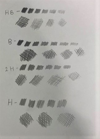
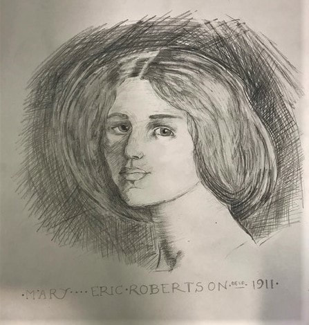
This week we had to produce three copied pieces of art, each completed using a different media. The aim of this task was to allow us, as developing artists, to understand how each material can be used and the effect of it when used correctly. The first artwork I copied was Eric Robertson's piece 'Mary' created using pencil, implementing the technique of cross hatching. Before starting this piece I practiced with different gradients of pencil to see the efficiency and the tone of their mark. I also practiced doing crosshatching as I often struggle to make my marks appear uncontrolled to get a more natural look. When starting on this piece I decided to begin with shading the face, making sure I captured the lights and shadows, I found it difficult to capture the tones of the skin at first, but as I got more confident with the technique it started to come together. The part of the drawing that I found most difficult was the hair, as I discovered that the artist Eric Robertson began with very dark tones for the hair which he then lightened using a rubber. I tried to recreate this effect by using a putty rubber which I manipulated into a point which seemed to create a similar effect. I then finished this piece by cross hatching the background, using a 2b pencil which I felt had a good range of tone and created the depth that I was looking for. I found the background hard as I felt that I wasn't being free enough with my marks, as I was concentrating to closely on the direction of my marks, once I started being more free with my marks the whole piece started coming together. Next time to improve, I will create more practices in order to feel more comfortable with my materials and be braver with the application and intensity of my mark-making. The second art work I copied was an illustration from Treasure Planet by Mervin Peake, this time cross hatching with ink using a dip pen.  In preparation for starting this piece i practiced using indian ink with different ink pen nibs to see how the ink was transferred onto the paper. I experimented with different pressures and strokes with the nib that i chose to see how it effected the mark. Once I felt comfortable with using a dip pen I began my copy of Mervin Peake's work. I found this piece challenging, as I struggled with the placement of my marks and I found it just as hard understanding where to leave negative space to make the black stand out. The part of the drawing that I found the most difficult was the hair, as it felt quite complicated due to the curves and the density of line. I tackled most of the piece by starting with the large areas of dense cross stitching so that I could work up to the more delicate areas of the work. I feel that I have created a good interpretation of the artists work, however to improve I would like to feel more confident with using ink so that I can put more energy into the work so the piece feels less like a lifeless copy. The third art work I copied was Claire Leighton's, "Country matters" completed using scraper board.  For me this was the most challenging piece out of the three, due to the fact that I had never used scraper board before. To complete this piece I used two different types of scrapers in order to get different thicknesses of mark. I began this piece by sketching out the piece with pencil on to the scraper board which left a faint mark allowing me to follow the pencil and get an outline of central figure. Before going in with the scraper I practiced using it first, playing with different ways of holding it to see how much of the ink could be removed at once and how to create small pinhole marks. When I eventually started scraping I found it difficult to control my scraper so it removed the right area of the board and ended p taking out bits that I had not wanted to, so I went back in with indian ink to cover it up. The most difficult part of this piece was the tree as it was very delicate and i struggled with creating the branches and then taking out the area for the sky. Overall, although I found this piece difficult I liked learning and practicing a new skill, to improve i will leave myself more time to add more detail and I will use a variety of scrapers to get better definition.
0 Comments
The Bauhaus produced many excellent artists during its short time as a school and was considered one of the best art schools of all time. An artist who taught at the Bauhaus was, Johannes Itten, who was a Swiss expressionist painter, designer, teacher, writer and theorist and was appointed as one of the first masters at the Bauhaus in Weimar by Walter Gropius. Until 1922–1923, he was both director of the preliminary course which he had developed independently for the introductory semester and master of form for all the workshops except for the ceramic, bookbinding and printing workshops. He contributed greatly to the school and was considered as one of the best masters at the school, as Instead of having students copy works of the Old Masters, he encouraged them to explore their own feelings and to experiment with colour, materials, and forms. This course emphasised three elements: studies of natural forms and colours, the analysis of canonical artworks, and life drawing. Itten’s strength as an artist was also heightened by the fact that he was a superb art teacher who taught his students in an unconventional way. His students were often given innate objects like steel, mud, glass, paper and wood to experiment with. As Itten was of the opinion that even the most simple of things could inspire creativity in a person. For Itten, colour was life and any world without a hint of colour in it was as good as dead. However, Itten was a follower of Mazdaznan, a fire cult originating in the United States. Itten's spiritualism and the reverence in which he was held by a group of the students some of who converted to Mazdaznan created conflict with Walter Gropius who wanted to move the school in a direction that embraced mass production rather than solely individual artistic expression. The rift led to Itten's resignation from the Bauhaus and his prompt replacement by Laszlo Moholy-Nagy in 1923. Work created by Johannes Itten
Constructivism first emerged as an artistic practice in the 1920s after the Russian revolution. The diverse experiences of the revolution ensured the development of constructivism due to the experience is agitation, understanding artist affairs and providing a revolutionary ideology which would be used to charge their artwork. constructivism was initially concerned with three dimensional structures. However, during the civil war constructivist artist created work such as, agitational posters which became one of the dominant art forms of constructivism for many constructivists. Gustav Klutsis was one of the pioneers of Soviet agitprop graphic design, particularly prominent for his revolutionary use of the medium of photomontage to create political posters, book designs, newspaper and magazine illustrations. One of his works that I am interested in his first photocollage Dynamic City, where photography was used as an element of construction and illustration. In 1920 Klutsis joined the Communist party; his works around this time set out to change the logic of political thought and propaganda into Suprematism form, often using documentary images of Lenin, Trotsky, and eventually Stalin in his radical poster designs.  Gustav Klutsis, 'The Dynamic city' (1919) Within this piece the artist has used a series of rectangular and cuboid shapes which jut out from a diagonal and break from the edges of the background circle which is central within the picture plane. klutsis' use of photographs creates a static and isolated shot, which is brought to life by the protusions of what appears to be three dimentional elements, such as buildings. Photomontaging allows the viewer to visualize unfolding themes of the given subject, creating a connection between political slogans and creating politically chanrged works. The artist has used photographs of American skyscrapers which are the rectangular shapes that the viewer, on closer inspection, can see the detail and the multitude of windows, creating the composition of his dynamic city. He also added phtotographs of workmen at the ends of the buildings. The symbolism of this deliberate placement suggests to the viewer that this is a flying city with its own gravity, which enables the men to stand upsidedown. Klutsis' style was to mix the familiar with the seemingly impossible to make the unfamiliar less improbable. Another artist I am interested in is Alexander Rodchenko. He was brought up in Kazan and attended the Art school there where he was heavily influenced by art nouveau and Beardsly. in 1914 he attended futurist meetings in Kazan, he then moved to Moscow and started in a graphics department which didn't last long due to his dis engangement witht the teaching. between 1915-16 he became aquainted with the moscow avant garde, contributing to contemporary painting exhibitions and cubist collages. In 1920 he became a co-founder of the First Working Group of Constructivists.  Alexander Rodchenko, 'Crisis' (1923) Rodchenko has also used photomontage for this piece which is characterised by the juxtaposing of images. Within this piece the viewer can see people falling from two aeroplanes onto a deteriorating urban landscape. The political and social connotations evident within this piece was often very overt within this artists work, for him advertising was a means of directly engaging in agiprop; "In every military victory, in every economic success 9/10 is the result of the skill and power of our agitation. Advertising is industrial, commercial agitation." It is clear that Rodchenko believed that his work was fulfilling its purpose too spread the propaganda through the country. Overall, comparing these two posters I can see many similarities in terms or colour palette and the use of shapes overlapping one another to created a distorted image. However, I also think that in term of their approach to propaganda each artist uses a different technique. For example, Rochenko is much more obvious with his agitation and created quite a graphic piece as the figures are seen falling to their death into a state of unrest. Where as, Klutsis advocates the rejection of painting and was actively involved in making production art, such as multimedia agitprop kiosks to be installed on the streets of Moscow, integrating radio-orators, film screens, and newsprint displays. Similarly though both artists used photo montaging which facilitated a new method for producing essentially militant posters. It is a characteristic feature that the poster surface is articulated and defined by the political content of the presented materials rather than by aesthetic quality.
Art Nouveau is an artistic movement which began in the middle of the 19th century and continues to influences art styles in the present day. The movements name has also been referred too as; "Jugendstil", "Nieuwe Kunst", and "Modern style", but the term Art Nouveau is directly translated from French into English as, "New Art". This was due to the freshness and excitement brought about by the characteristic elements, such as the stylized form which took a lot of inspiration from nature and geometry. With a clear emphasis on the use of flowing line, which brings a sense of melody and romanticism to the works. Many of the figures who appeared within Art Nouveau were elongated feminine forms, dressed in long flowing robes giving them a fairy like presence and a sense of purity, captured through the crisp use of line. No single architect, designer or artist epitomized the 'New Art' style, it was the response from multiple creators that caused Art Nouveau to have such a diverse and complex interpretation. The myriad of influences and interpretations from across Europe had the single purpose of defeating the established order within the applied and fine arts. A H Mackmurdo, who was known for his part in the Arts and Crafts movement, had a significant influence on the style of Art Nouveau by providing insight into the technical implementation of design. Mackmurdo's designs were very different in comparison to many European artists of his time. Many elements established him as an expert at his craft, firstly his use of simple lines and asymmetrical compositions, which were boldly rendered in black and white. As well as, his use of natural imagery and the way he manipulated form creating an abstract appearance. One of his most famous pieces was the Chair back (1883), which came before the Fin-de-siècle decorative movement, is renowned as a pivotal Art Nouveau influence due to the row of slender tendrils that capture movement within such a stationary object.  Arthur Heygate Mackmurdo, Chair, c. (1883) Art Nouveau was prevalent throughout Europe, but especially in Glasgow, Vienna, Madrid and Nancy. Charles Rennie Mackintosh dominated the new art movement within the 1900s, as a young architect he introduced a highly distinctive style of decorative aesthetic into his building designs and their interiors. Which were decorated with roses, apple pips, trees and tulips. However, his way of working was mostly inspired by that of geometry, hence the use of bold outlines and box- line shapes, which became highly recognised within Art Nouveau houses and highly influenced the style of ornamentation in Vienna. Art Nouveau in Vienna was most popularly characterised by the artists Koloman Moser, Josef Hoffman, Joseph Maria Olbrich and Gustav Klimt. Gustav Klimt had one of the most influential styles within Vienna, using surface decoration, flowering curves and rich ornamentation. He used symbolic feminine imagery and is best known for his portraits of young women stood in front of highly decorated backgrounds. However, in Spain Gaudi is the most well known artist within Art Nouveau, taking the majority of his influences from nature he began to blend innovative structures with decorative effects. His most celebrated buildings take on the personification of living organisms with the smooth rise and fall of their walls, as in his opinion there are no straight lines in nature. Finally in Paris, more specifically Nancy, which was the area most caught up in Art Nouveau, the influential artists were Emile Galle and Louis Majorelle. Emile Galle, who became popular in 1880s, took inspiration from Japonisme which was closely linked to nature. He was passionate about the use of nature and it was his primary focus within his work and the majority of Art Nouveau furniture produced in Nancy incorporated nature, such as flowers, dragon flies and was centralised around a decorative theme. Galle spearheaded the drive for change, he worked in glass, jewellery, ceramics and furniture making all the while incorporating his decorative new art style into all of his works,
Overall, it is believed that Art Nouveau suffered in popularity because it was promoted in large parts by brilliant artists and designers scattered across Europe. Meaning its momentum as a movement was fuelled more by the achievements of the independent artist, rather than the success of the style as a whole. However, I find that Art Nouveau was a most interesting movement, which inspired such a wide variety of art styles, spread across Europe. In Glasgow and Vienna the style was more serious and restrained, but in Nancy and Spain there was an enthusiasm for the natural which was captured in every element, but each style was an act of protest against the traditional and the ordinary. Japonism is the study of Japanese art, which was very influential on Europe during the 19th and 20th century. European artists learned a variety of artistic methods from Japan. For example, using unusual compositions and placing cut-off objects in the foreground of their work. Many well-known artists became passionate about Japonism and implemented the style within their own works, some copying directly from original Japanese art and others using the techniques and symbolism to highlight their interest in the style. It is thought by many that Japanese art was first introduced to Viennese society by Klimt and the Secessionists through their sixth exhibition, which devoted entirely to its aesthetics. Klimt was an avid collector of East Asian art objects, for example, woodcuts, Noh masks, ceramics, and textile designs. Many of these objects inspired his works and there design principles greatly influenced Klimt’s approach to drawing and became an integral part of his style. In the artworks pictured below, there are many visual similarities between Klimt's portrait and Eizan's. For example a kimono, which is a well-known piece of Japanese clothing, is present within both pieces and is strongly enhanced through the use of colour and detailed backgrounds.  Gustav Klimt, "Portrait of Eugenia Primavesi", 1913-1914 (left). Kikukawa Eizan, "Courtesan of the Ogivia Brothel", 1810-18-15 (right). Though Ukiyo-e prints were extraordinarily popular with European artists and art lovers alike, Claude Monet had collected an impressive, range of woodblock prints and was greatly inspired by the Japonism art style, subject matter, perspective, and composition. Using distinctively dappled brushstrokes, and characteristically colorful range of tones, which focused on light, the French artist created compositions that captured the essence of the movement, which was influenced through the Japanese art style. The central compositon of Klimts work has been so obviously inspired by Hokusai. While many artists working with paper try to create realistic senses of perspective, those specializing in woodblock prints were less concerned with depth and dimensionality. Instead, they favored strong shapes, graphic designs, and bold lines. This approach can be seen within both pieces, conveying that Klimt has experimented with a different approach to his positioning of objects.  Monet, "The Japanese (the water lily pond)", 1897-1899 (left). Hokusai, "Under Mannen Bridge at Fukagawa", 1823 (right) Overall, I have found that Japonism and Japanese artists deserve more credit in the part they played in advancing the development of modern art, especially in terms of impressionism, changing the way that artist experimented within their own work and how they presented it to the viewer.
|
Izzy CarrollSecond year Illustration student at Cumbria University. Archives
December 2019
Categories |

 RSS Feed