|
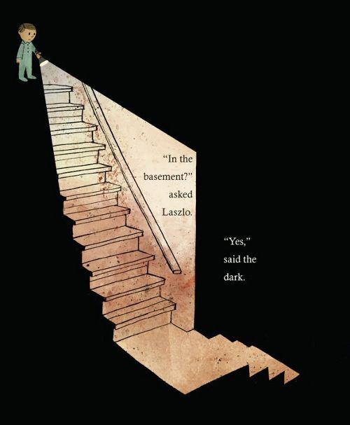
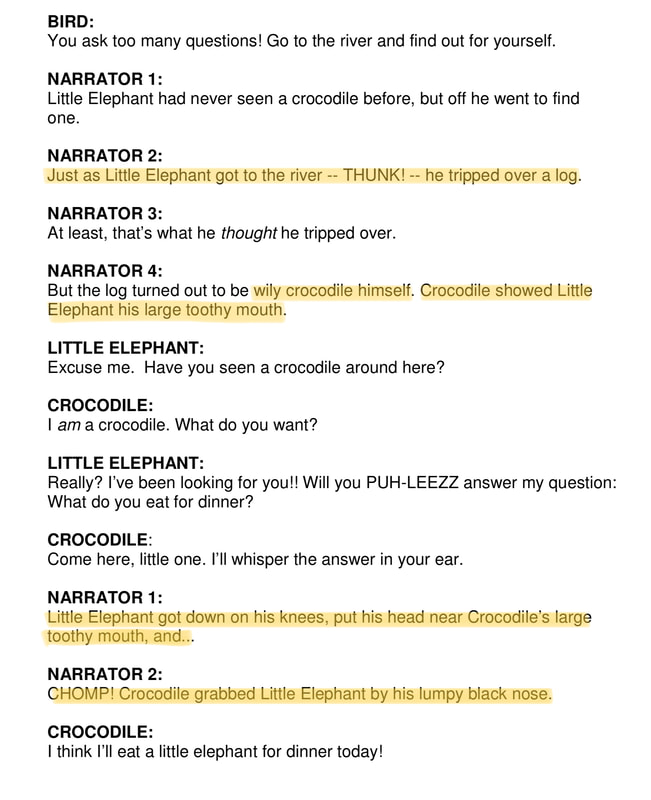
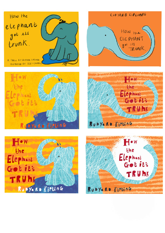
Deadline: 9.30AM, Thursday 18 March BriefUnlike previous briefs, here you have a choice of which problem you will respond to. Pick one of the following 4 pathways, each of which poses a slightly different problem as detailed below. 1 Editorial 2 Narrative Fiction 3 Picture book for early readers 4 Song Lyrics Once you've picked a pathway you have another choice. Conceptual or literal (in the interest of simplicity and clarity this choice is to be applied to each component illustration you produce. No pick n mix visual languages). Picture Book for early readersYou are asked to provide 3 illustrated pages by way of 'proof of concept' for your book. 1 double page spread 1 single page a front cover design You will need to consider and demonstrate the integration of image and type. InspirationWhen initially looking for inspiration I have focused on researching children's books that illustrates different aspects of childhood and also confront hard hitting subjects such as sadness and being afraid of the dark, to further understand the role of children's stories and the way narrative and illustrations work together to create a full piece. As well as looking at more enigmatic stories that are vibrant and colourful such as Tom Gaulds 'Pokko and the Drum' to really get a feel for how different styles of illustration can be used differently within children's books. Specific ResearchI have decided to illustrate this version of Rudyard Kipling's How the Elephant Got its Trunk (ignoring the narrative instructions). As I am only to produce the concept of my illustrated version of this classic tale I will focus on the parts of the text that are the most engaging! Although you’ll find that many online printing companies will print children’s books in a broad range of sizes, you should be aware that there are a few accepted ‘industry’ sizes. If you size your book to industry-friendly dimensions, you’ll be more likely to have your book bought by a distributor or bookshop. The three most popular industry-standard sizes for children’s books are:
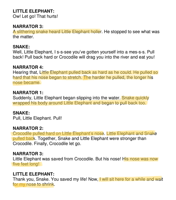
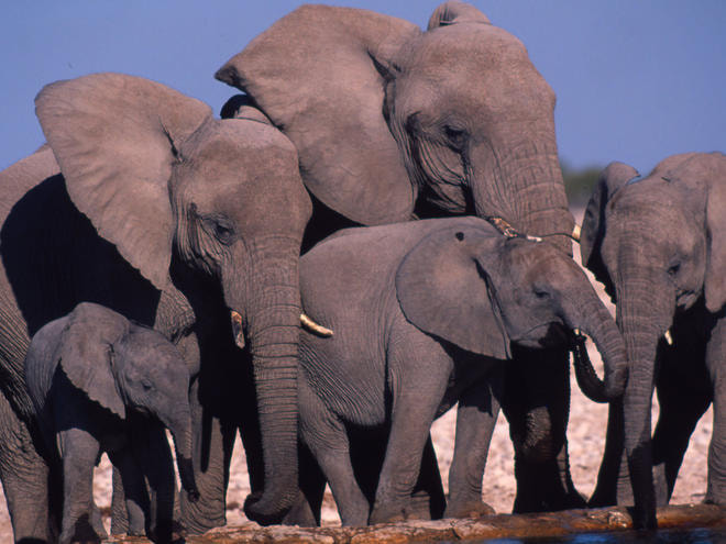
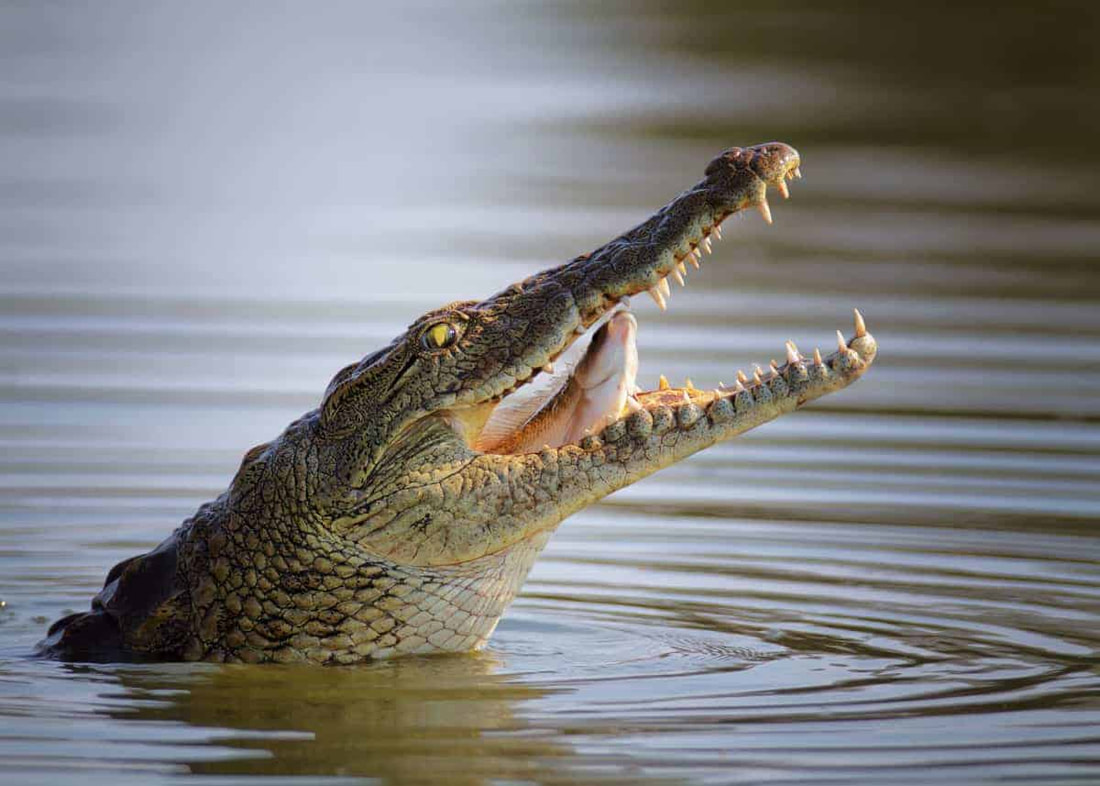
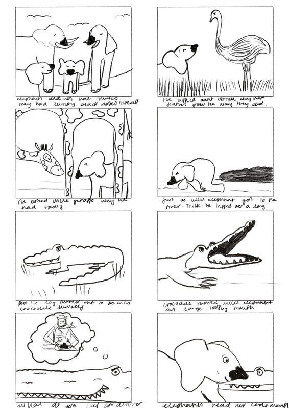
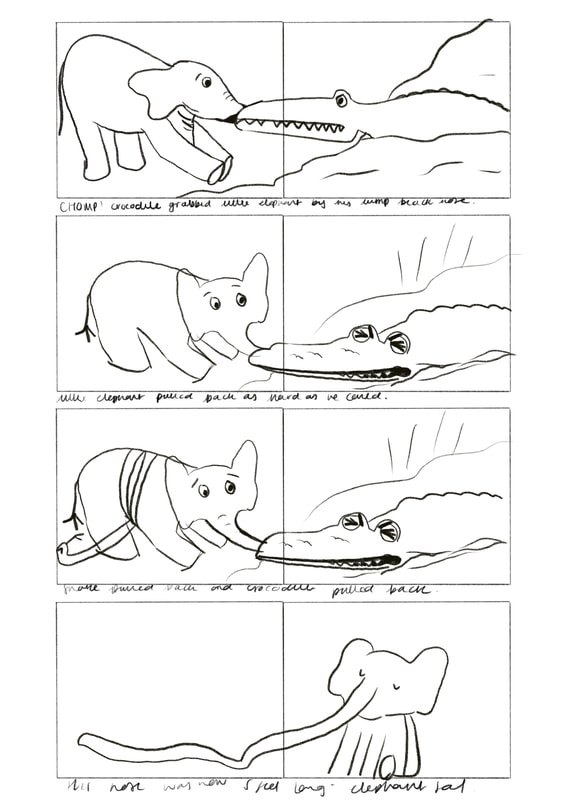
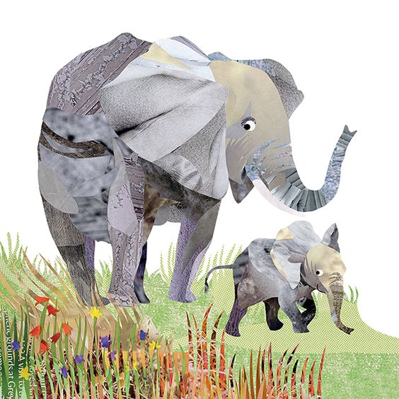
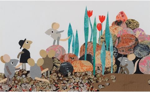
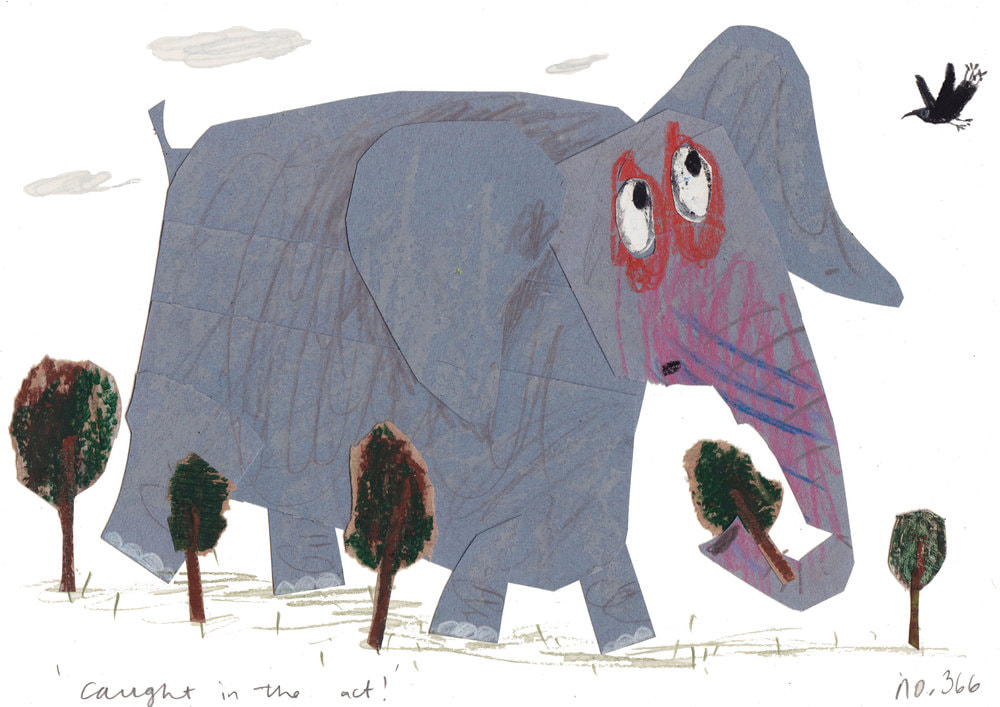
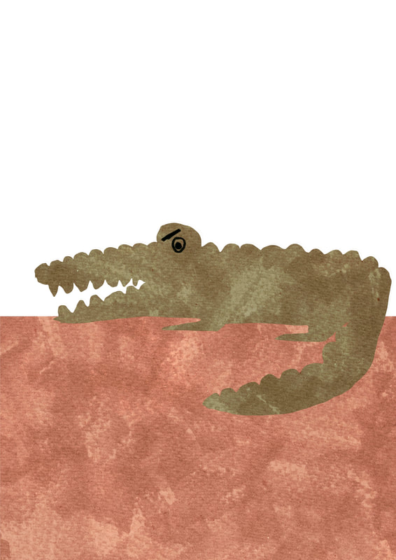
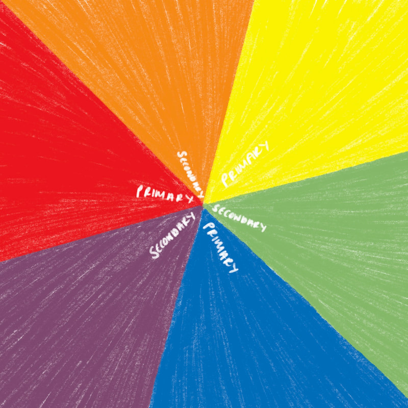
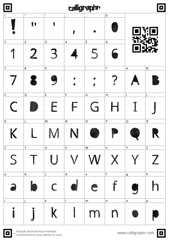
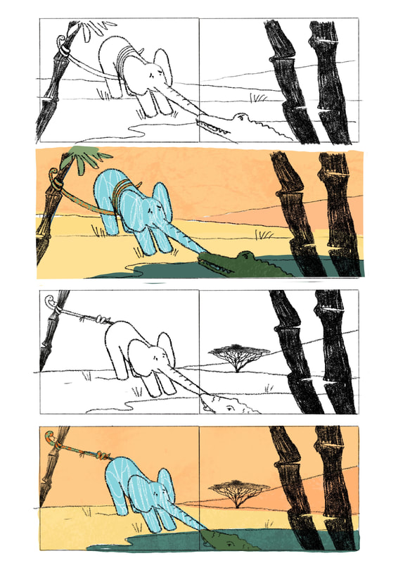
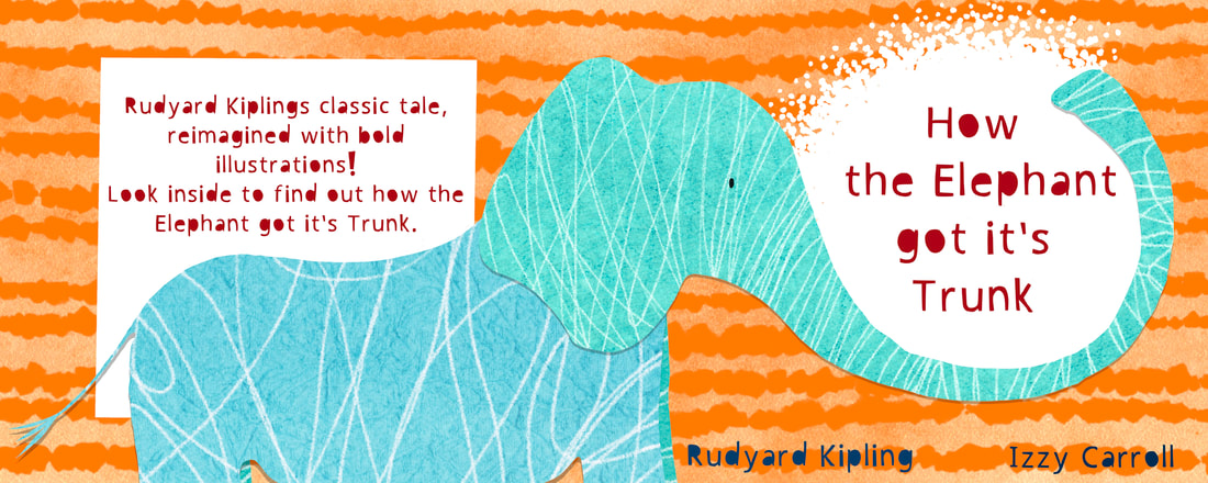
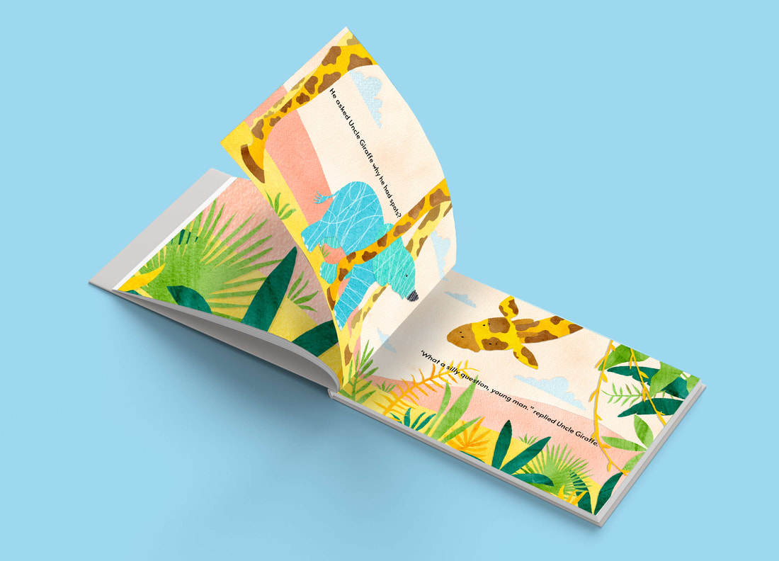
Annotated textI have highlighted parts of the story which I think have the most visual language and would make good illustrations within the picture book! Animals from the storyResearching the key animals in the story gives me reference photos to work from and also provides me with a natural colour scheme. Idea generation: ThumbnailsI have kept these thumbnails very simple as I just wanted to get the initial story down into visuals as that helps me see what ideas I want to develop on. Focused inspirationI have decided to look at using collage as a way to illustrate, combined with more traditional mediums such as ink - to look at the combination of textures. As well as looking at the collage technique used digitally. DevelopmentI wanted to do a little bit of experimentation with creating a collage using procreate and experimenting with textures to see how successful the process would be. From creating these mock ups I have been able to see where I need to focus my energies, from composition to colour palette and of course considering the incorporation of text. Josef Albers - The Interaction of ColourAfter feedback on my initial development I was tasked with looking at Josef Albers colour theory and I happened upon this video, which goes into detail about a lot of Josef Albers theories and ideas, one that is very important is making 'one colour look like two'. From this video I have learnt that you can make one colour look like two, depending on the background colour that you use, it also showed me that different colours can make things appear up close or far away in a similar way. Basic colour theoryCreating these little colour charts was not only satisfying, but also refreshed my understanding of colour and the way that colours can work together. For example colours next to each other on the colour wheel are harmonious colours as they automatically look good together due to being made up of similar colours. As well as this, complimentary colours are opposite on the colour wheel and look good together as they are so different and can make a piece more vibrant! There are lots of resources and articles out there which are helpful when it comes to learning about colour theory. Making my own TypographyFor this project I have explored new ways to make my own typography, using free front making websites to convert my own hand writing into a font as well as digitally cutting out type from textures. I think it was really useful to learn this new skill and I’m hoping it will enhance my final outcome with that extra added thought. Refinement: Thumbnails double page spread'Hearing that, Little Elephant pulled back as hard as he could. He pulled so hard that his nose began to stretch. The harder he pulled, the longer his nose became.' Refinement Thumbnails: 2 x single page‘He asked Uncle Giraffe why he had spots?’ ‘What a silly question young man’ Refinement Thumbnails: Front coverWorked up visualsDurning a feedback session I asked my classmates which background they preferred and they all unanimously agreed that the beige background worked best. 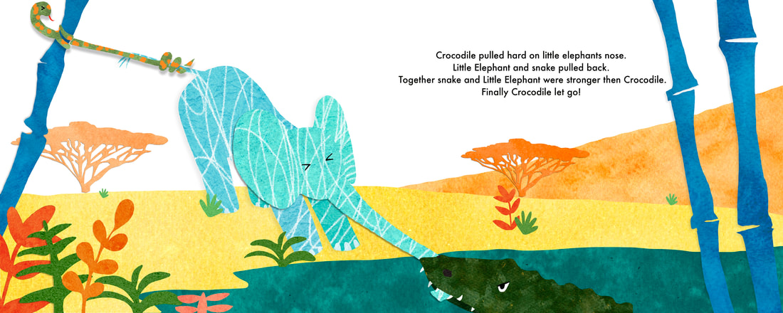   Choosing a fontChoosing what font to use in a children’s book is just as integral as the illustrations themselves, as the wrong font will make or break a piece of work. I have tried to used a varied choice of fonts in my experimentation in order to compare which ones work best.     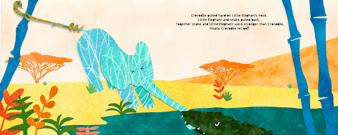 Final outcomeFinal outcome includes a wrap around cover, and two double page spreads. I did a little bit more work than was required but I really enjoyed this project and found that doing things as double pages help me visualise the final products more successfully!    Mock upsI find it helpful to see my illustrations in context and is it’s also really satisfying to see what they would look like in a book!
0 Comments
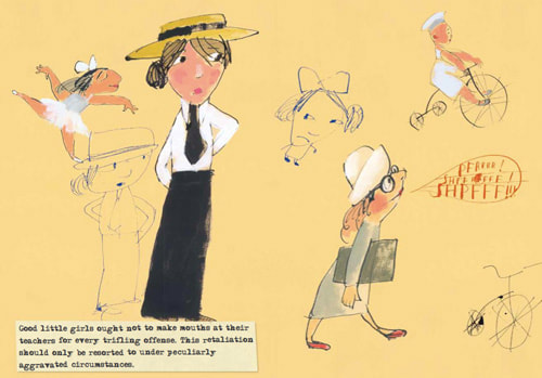
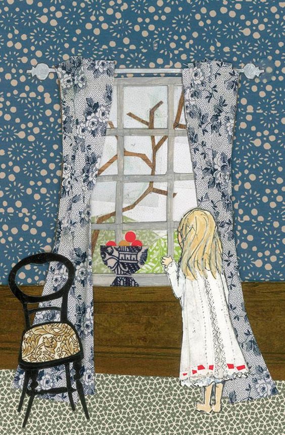
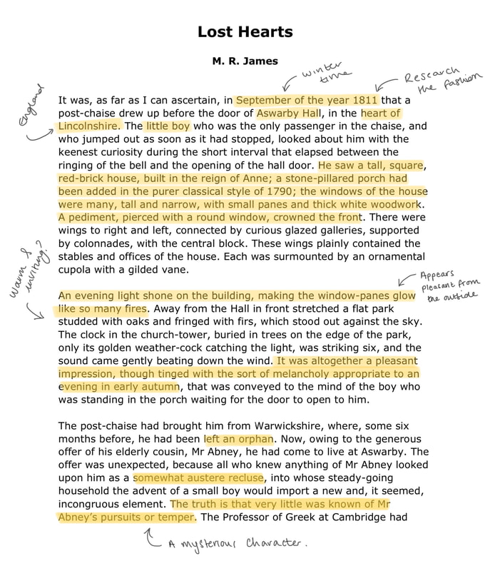
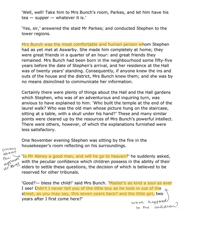
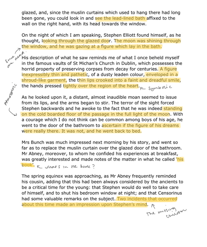
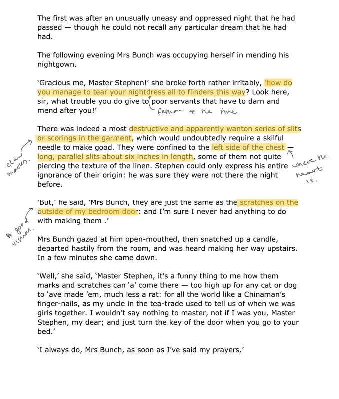
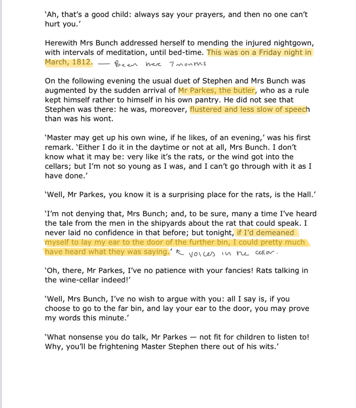
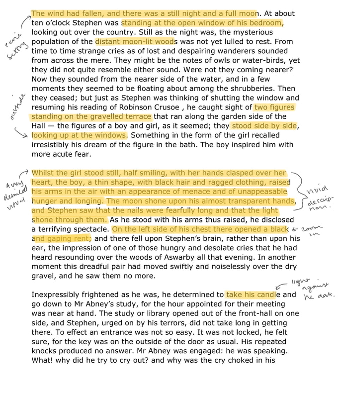
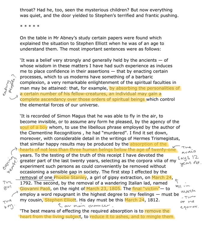
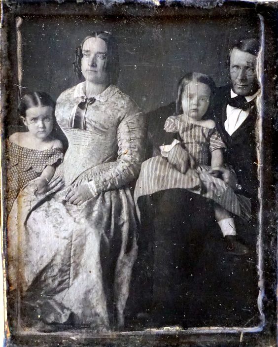
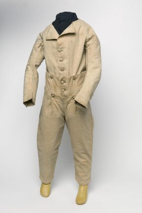
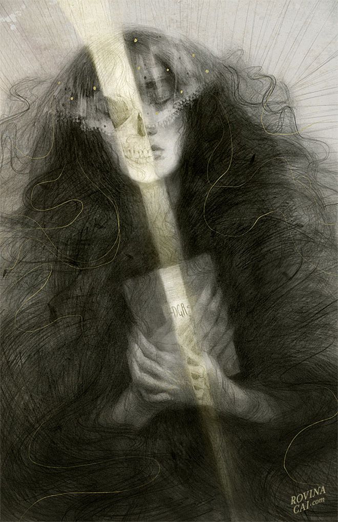
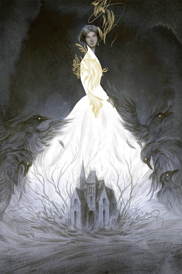
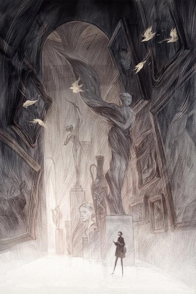
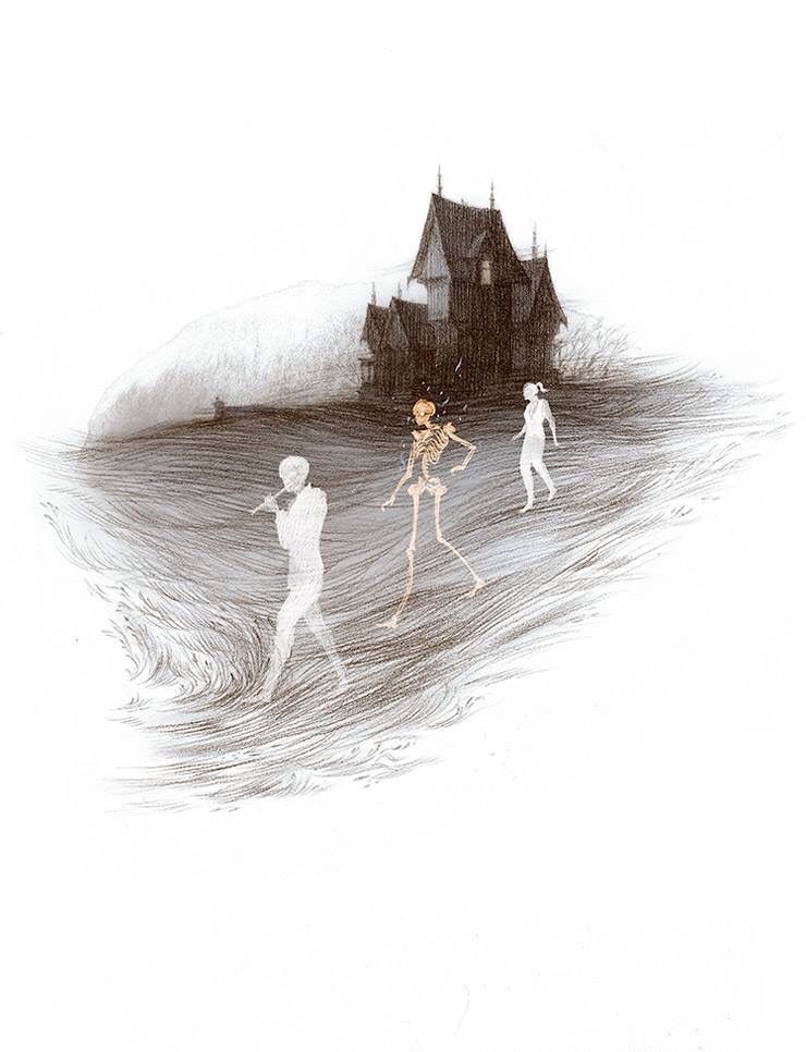
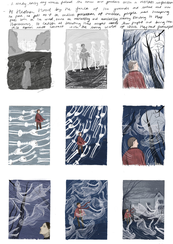
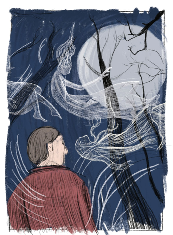
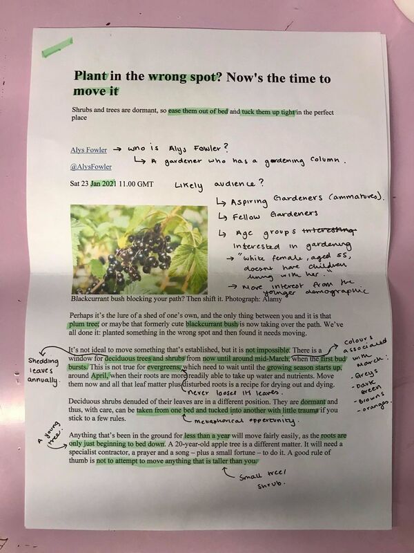
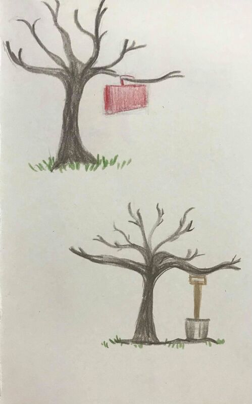
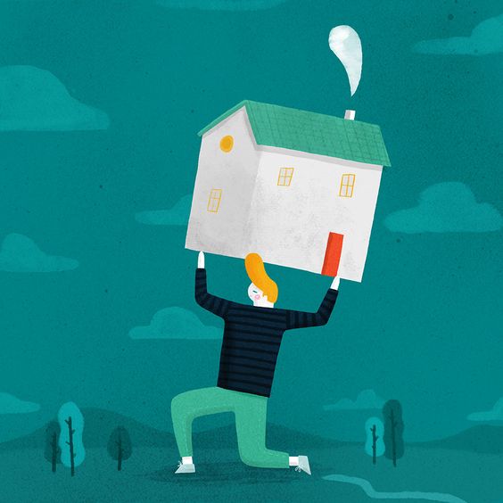
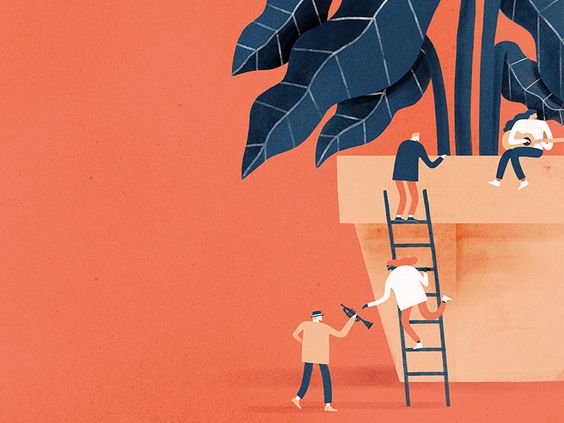
Deadline: 9.30AM, Thursday 25 February BriefIn this brief you will focus on creating illustrations that are a visual representation of the author's words you have been given. This is what we would call 'literal' illustration. You will be provided with a short story and are asked to produce two illustrations to accompany it. One illustration is a full-page, full bleed image which should be presented as follows: CMYK - image size 160mm wide X 226mm high at a resolution of 300 dpi. Note: this dimension includes a 3mm bleed around all four sides. The second image is a black and white chapter heading that is aligned to the body of the justified text. As such it must occupy an area of 105mm wide X 50mm high. Note: there is no requirement that it has to have a crisp, rectangular edge so you may treat it as a vignette. The final artwork should be presented as a 300 dpi, grayscale image. ResearchMy short story is "The Lost Hearts" by M. R. James, a well known writer of short horror stories. Key Notes: -Set in the 1800s in Lincolnshire - Main characters include: Mr Abney, Stephen Elliot (orphan boy), Mrs Bunch, lost little girl and lost little boy. -Theme of the story, two children go missing and haunt Stephen, Stephen wonders what happens to them and is wary of Mr Abney. He finds out about the circumstances of their death when he finds mr Abney dead in his chair and reads from his book. It is revealed that Mr Abney killed both children and ate their hearts to gain immortality, he was planning to do the same to Stephen but the ghost children kill Mr Abney before he can go through with it. Annotation of Short storyAs wells as listening to the mp3 of the story to get the atmosphere of the piece, I also went through and annotated the story, picking out areas of detail that would help inform my practice and selecting areas of the story that I felt would produce an interesting visual. BBC adaptationI watched the bbc adaptation of ‘Lost Hearts’ just to get a feeling for the setting and the character choices. However, the story didn’t stay true to M.R. James writing and added in elements which I suppose were for character development but didn’t add much to the story. It was interesting to see how it has been adapted to screen, but I think I will rely on my own imagination and the written text for inspiring my development. Fashion in the 1800swhile researching into the fashion of the time I found an interesting blog on skeleton-suits, which boys between the ages of 4-11 would have worn in the 1800s. As the main character in my story is an 11 year old boy, I was interested in learning what they would have worn in the 1800s and they mostly dressed like little men with trousers, jackets and waistcoats. I also learnt that little girls would have worn their dresses to a certain length to indicate their age, however this wouldn't have been the same for the poorer population, as they often wore handed down clothing. InspirationI have looked at a few different illustrators for this project to get an idea of how different styles can be successful when illustrating a scary story. Artists I have researched include, Isabella Follath, Anja susanji, Rovina Cai and Shaun Tan. ThumbnailsAfter feedback on my thumbnails I need to consider my use of composition and angles in order to create more dynamic imagery and add to the theme of horror and foreboding. Using reference imagery may help me to get a better grasp on body language and composition. I have also decided to focus on a specific area of text which really stands out to me: “a windy, noisy day, which filled the house and the gardens with a restless impression. As Stephen stood by the fence of the grounds, and looked out into the park, he felt as if an endless procession of unseen people were sweeping past him on the wind, borne on restlessly and aimlessly, vainly striving to stop themselves, to catch at something that might arrest their flight and bring them once again into contact with the living world of which they had formed a part.” Focused thumbnails / Chapter Header thumbnailsFocusing on getting the idea of a ‘procession of unseen people’ and linking the chapter header illustration to the story but not necessarily the main image. Worked up visualsThese ideas are the three which I think are the most visually interesting and also tell a story. Final outcome - Chapter Header Final outcome - full page, full bleed, full colour Book mock ups Deadline 12th Feb. BriefCreate a conceptual illustration and gif for an allocated article. Illustration x1 - 120 x 120mm (CMYK) Gif x1 - animated version of print (RGB) Link to allocated article here ResearchSubject of article: how to move a plant from one area of your garden to another. Source of article: Alys Fowler, a gardener, who has a gardening column for the Guardian. Audience: Aspiring gardeners, garden enthusiasts, demographics suggest middle age women living on their own are most likely to read a gardening article. Initial sketchesSome quick rough sketches produced using gouache and watercolour pencils. InspirationWhen looking into conceptual illustration I found the artist Mark Conlan. I was very much in awe of his colour palettes and the interesting ways he approaches conceptual illustration. Many examples I found of his conceptual illustration was about moving house, which I found really helpful when coming up with ideas for my own project about moving plants. ThumbnailsA more conscientious attempt to produce thumbnails, using a limited colour palette and working within a square composition.  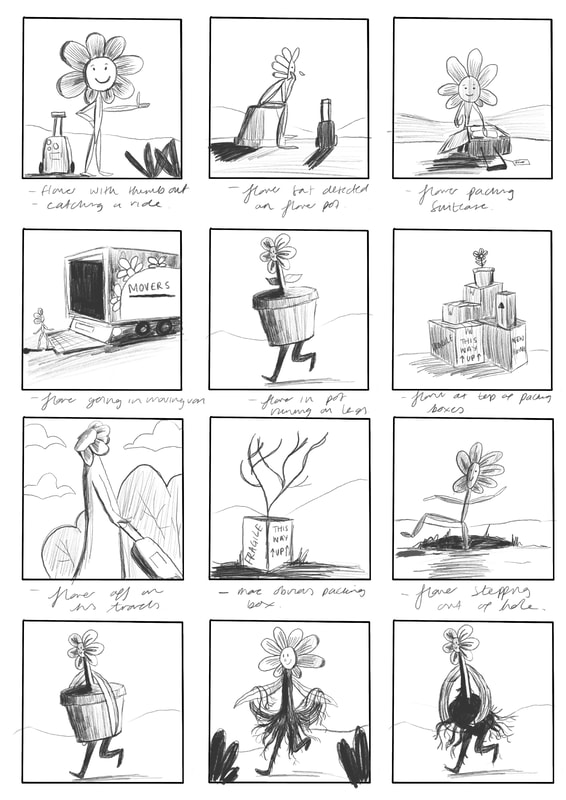  DevelopmentBy this stage of the development process I knew that I wanted to incorporate both a tree and a flower into my final outcome. I created a few different ideas when it came to the flower, as I was unsure about how I wanted it to look. I decided at this point that the flower with the nap sack, holding on to his pot was the character with the most visual language. 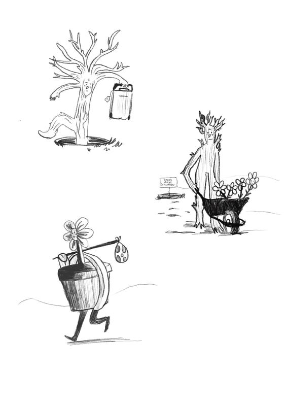 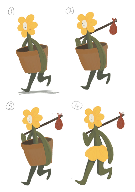 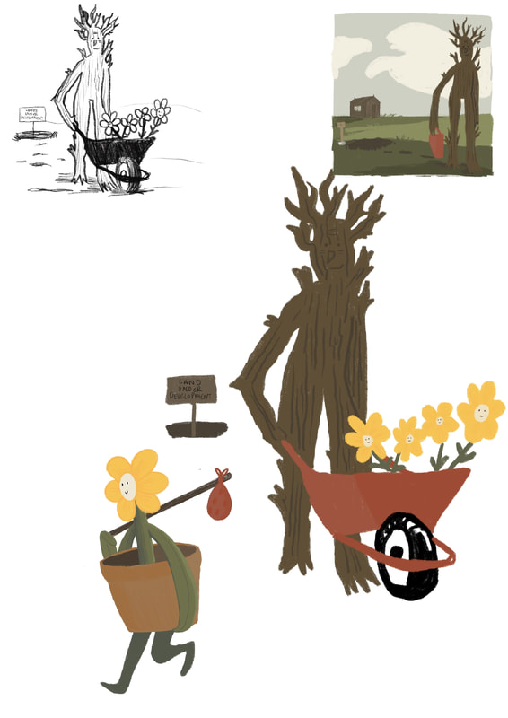 Worked up visualsI created three worked up visuals looking at the different ways I could communicate 'moving' through the body language and visual language of my characters. After a feedback session I decided that the tree with the wheel barrow was the most effective in terms of story telling and included the right amount of humour and was dynamic. The things I needed to consider to create a successful outcome was working on the composition to add depth, as well as making my background appear more garden-like. I also felt that the colour of the flower was getting a little bit lost within the piece and also didn't resemble any real flowers, so I needed to change that for my final outcome. Further considerationsWithin these pieces I have used a much more limited colour palette and a reduced background in order to align my work more intentionally with that of Mark Conlan’s. It was a very informative exercise and allowed me to consider my use of colours. However, I didn’t feel that these attempts were as successful as my final outcome and so I did not take them further. Practice GIF Final OutcomeI have created my final outcome to the dimensions 120x120mm. Within this piece I feel I have made the relevant changes that I specified in my development process. I changed my flower to a pansy as they are flowers which can survive in the winter months, which makes sense for my article. I have made my background feel more like a garden by incorporating a greenhouse as well as a sturdy garden fence.  Final Gif Mock ups  |
AuthorWrite something about yourself. No need to be fancy, just an overview. ArchivesCategories |


 RSS Feed